Form Dialogs
Contents Hide
Form dialog components are the building blocks of the application similar to lego blocks. Each dialog defines a high level form with simple and common functionality within the application. For example, a login dialog is used to provide login capabilities to the application. Through these high level building blocks the goal is to provide an enhanced visual development environment without the hassle of coding.
The user can add dialogs to their applications by dragging and dropping them from the Application panel top toolbar into the application canvas. Form dialogs can be double clicked on to open the specific dialog editor window. Through these specific dialog editors, numerous properties and options can be added and/or altered to cater to the developers needs without any coding. Every form dialog editor will provide the options available and a WYSIWYG (What You See Is What You Get) window where the different components can be changed through the various visual components, to appear as desired on the form.
Dialog Editor
Each form dialog will have a specific editor tailored for each dialog type. With these editors, the different properties and functionality available to each form dialog can be edited and changed according to the developers requirements and specifications. Each dialog editor will follow the same pattern of having three main sections in which the dialogs properties can be changed. One section will contain the unique properties for that dialog (such as the list columns shown in a listview) where these properties can be changed to alter the basic form dialogs design and functional behaviour. Another section is added to the editor to display the form dialog at its current state and show how the form will look on a device screen when executed. Through this section the different components can be moved and resized according to how the form is desired to look. One final section will contain a list of components on the form and a properties panel. When a component is selected, the properties panel will be populated with each components specific properties related more to the components design such as positioning properties.
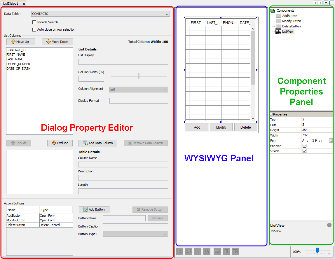
Dialog Property Editor
The Dialog Property Editor is a section within the dialog editor that will contain the various unique properties for each form dialog. Through this editor, the various properties and functionality unique to each form dialog can be edited and tailored according to the applications specifications. For example for a menu dialog, this section will contain the list of menu items in the dialog where also each menu item can be added, edited or deleted. The Dialog Property Editor provides the avenue to alter the basic functionality of the form dialog without the need for any programming at all. For newly created form dialogs, each will be instantiated with default behaviour and functionality. For example, edit dialogs will initially contain two action buttons, one for saving the record into the table and the other for deleting the record into the table.
 Fields
in this dialog property editor may be highlighted with red borders
in certain scenarios. This indicates that the field is invalid
or incomplete, and requires attention. For more information on
validation in the Business Application Designer, please refer
to the Project Validation chapter.
Fields
in this dialog property editor may be highlighted with red borders
in certain scenarios. This indicates that the field is invalid
or incomplete, and requires attention. For more information on
validation in the Business Application Designer, please refer
to the Project Validation chapter.
What You See Is What You Get (WYSIWYG) Window
The WYSIWYG window will display the current state of the form dialog and how it will look like on the device screen. Through this section, the multiple components on the form dialog can be rearranged and placed in appropriate places. The window will display the form bounds of the form through the black rectangular outline shown. Anything within this outline can be seen within the form and all components should be placed and arranged within the form bounds. By selecting a component, the component can be resized by dragging the shown anchors in the appropriate direction.
The WYSIWYG may be displayed with or without a Device Image, which is assigned based on the form dimensions. The device image may be toggled by right clicking outside of the (bordered) canvas and selecting 'Show Device Image'.
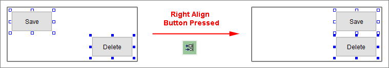
On the bottom of the window, alignment buttons can be found which allow for the components to be aligned according to the button pressed. These components can be left, right, top and/or bottom aligned. To be able to utilise these buttons, more than one component must be selected. The component selected with solid blue square will be the lead component in which the other selected components will follow.
Next to these alignment buttons, resizing buttons can be found. These resizing buttons can be used to enforce the same height and/or width onto the components. Similarly for the alignment buttons, the component selected with solid blue squares will be the lead component that will dictate its size onto the other selected components. Zooming into the form dialog can be done through the zooming dial.
Components Panel
The components panel is used to provide the list of components that are contained within the form and provide the ability of selecting these components and alter advanced properties unique to each component type. With the components panel, it is split into two different panels. The top panel displays a list of components currently placed in the form dialog. When selecting a component in this list, the component will become selected in the WYSIWYG window and the bottom panel will become populated with the component's advanced properties. Through this bottom panel, the specific properties for these components can be viewed and altered. These properties are advanced features that can be modified to change specific properties of the component such as display and behavioural features.
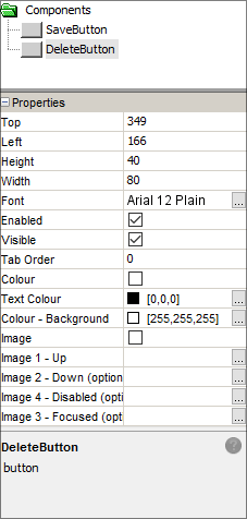
For example, when a button component is selected, the properties panel will display formatting properties for the button such as the dimensions and font of the caption. Additionally, the behaviour of the button can be altered to display images on the button under different states of the button (i.e. button pressed or button disabled etc). Each type of component will have different and unique properties to each. Using this panel, the components can be changed even further to allow for more flexibility in the form.
Form Dialog Types
The type of form dialog determines how the user interfaces with the application, and how it captures or displays data.
For more details on the different types of Form Dialogs, please refer to their respective chapters:
Form Values
Each dialog will have predefined unique values called "Form Values". For example, settings dialogs provide all the settings within them as form values and list dialogs expose the column values of the selected row in the list view control. Form Values are values that can be used within the application to store data.
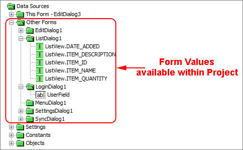
They can be used throughout the application where a data source tree is presented such as within a calculated phrase in a edit dialog. They can also be used within a table filter for a sync request in sync dialogs. Form values can also be used to specify the context in which the child dialog will open in a form link. The form values each form dialog will have are explained below in each individual section explaining each form dialog. It should be distinguished that the data source found within the 'This Form' branch are not form values, they are the control values within the form that will have local scope of the form.
Life Cycle
When the application is executed through BrightForms, the form values will preserve their values until the BrightForms app is closed. These form values are initially instantiated with null values. However once these form values are given values within their respective form dialogs, these form values will be persisted throughout the application while the BrightForms app is open. If the BrightForms app is closed, these form values will hold null values until instantiated again. The only exception to this are Settings defined through Settings dialogs. As opposed to form values, settings values are persisted even when BrightForms is closed. If values are to be kept persisted and used within the application then Settings should be used instead.