Menu Dialog
Contents Hide
Menu Dialog 
The Menu Dialog is tasked in providing a menu to applications. The form contains a series of buttons where each button represents a menu item. Each button will open another form assigned through a form link. Form links can be created and assigned in the Application Panel. Menu dialogs will have no form values.
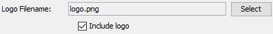
Logo
In the Menu Dialog editor, you have the option of adding a logo as well. By pressing the 'Select' button you can choose the image you want to display on the login form. There is also a checkbox in which you can tick to include or untick to not include the logo on the form. When 'Logo Filename' is set to an image, the WYSIWYG window will display the image. In this window you can click on the 'LogoImage' component to change the properties of the image such as its size and style.
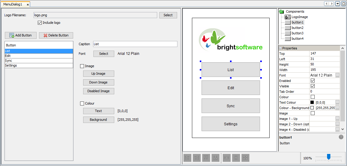
Menu Items
Menu Items are represented as buttons
on the form. Each button can then later be set to open another form
through form links. By pressing the
 button you can add new
buttons/menu items to the form. Using the
button you can add new
buttons/menu items to the form. Using the  button
you can delete any unnecessary menu items.
button
you can delete any unnecessary menu items.
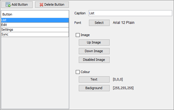
Next to the list of buttons you will see options to change numerous properties of the currently selected button.
Caption: Here you can edit the caption that will be displayed on the button. Changes will be reflected in the WYSIWYG window in real-time.
Font: The font attributes such as font, font style and size can be changed by clicking the 'Select' button to open the 'Choose Font' window.
Image/s: Each button can have the ability to use images to be shown when the button is in different states (such as button is not pressed (Up), button pressed (Down) etc). By ticking the checkbox, the images set for the 'Up Image', 'Down Image' and 'Disabled Image' properties will be shown instead of the caption.
Colour: The colour of the text and background colour of the button can be set here. The 'Choose Color' window will appear when the 'Text' or 'Background' buttons are pressed allowing the corresponding colour attribute to be changed. The RGB values will display next to these buttons and the colour will be updated on the WYSIWYG window. When the checkbox next to 'Colour' is ticked, the selected button will use the RGB values specified.
Additionally, you can edit the properties of the controls on the form through the WYSIWYG window and click on the components to populate the property window.