Edit Dialog
Contents Hide
Edit Dialog 
Edit dialogs will provide the ability to modify a data table through providing a form with multiple controls for user input. An edit dialog can add new records to the table or modify an existing record in the data table. An edit dialog can also be used to view a record in the data table in a read-only mode disallowing any editing of the data. Thus when an edit dialog is to be opened, the context in which it is to open must be set through creating form links and the form link editor window. For more information refer to the Form Links chapter.
Data Table
Similarly for list dialogs, you can bind the data table which will be modified through this edit dialog. You can also create the table of which will be binded by selecting the '<Bind to New Table...>' option in the drop down menu.
The behaviour of the edit dialog can also be changed by adding auto saving the record when the form is closed. If the form has been opened in the context of adding a new record to the data table with this behavioural option enabled, when the form is closed, the current values in the fields will be added as a new record in the data table. While if this form is opened in the context to modify a record with this option enabled, the record will be values entered in the form will be auto saved back into the data table. The option can be enabled by ticking the checkbox next to 'Auto save record on form close'.
Form Behaviour on Close
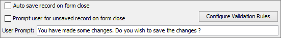
Within edit dialogs, further options are available to dictate the behaviour of the form dialog when the form is to be closed. Application designers currently have the ability to auto save what has been entered in the form into the specified data table. This feature can be enabled by the 'Auto save record on form close' option. If the form was opened in the context to add a new record to the data table with this option enabled, then a new record will be added to the data table comprised of what had been entered into the fields. If the edit dialog was instantiated to modify an existing record, if this feature is enabled and the form is closed, then any changes made to the field values will be updated into that record in the data table. By providing this functionality, mobile applications can be made with simplicity and user friendly with minimal amounts of screen taps.
The edit dialog may also be defined to prompt users to save any unsaved data when the edit form dialog closes, using the 'Prompt user for unsaved record on form close' option. This feature can only be enabled when auto saving of records option is disabled. If this option is enabled and field value/s have changed from what they have been instantiated with, the user will be prompted with a message asking to confirm the close (where a 'Yes' response will close and save the values, and 'No' will close and discard values). The message displayed to the user may be modified by the 'User Prompt' field under this check value.
Form Validation
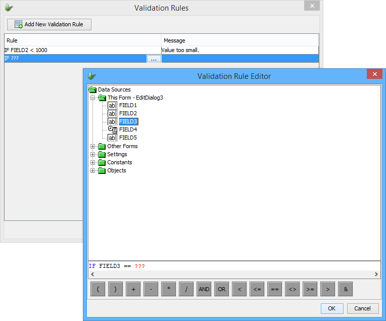
In addition to the above On Close options, the 'Configure Validation Rules' button may be tapped to open the validation panel. Here, rules for fields may be established which will be evaluated on close; if these are not met, the user will be prevented from saving records in the form. Right clicking the table, or tapping the 'Add New Validation Rule' will insert a new entry for a validation rule. Initially, this rule will display with a red border, indicating it is incomplete.
Tapping on the ellipsis ( )
in the 'Rule' column after
selecting the row will open the Validation Rule Editor to specify
the condition. The message displayed to the user if the rule is not
met is specified in the 'Message'
column.
)
in the 'Rule' column after
selecting the row will open the Validation Rule Editor to specify
the condition. The message displayed to the user if the rule is not
met is specified in the 'Message'
column.
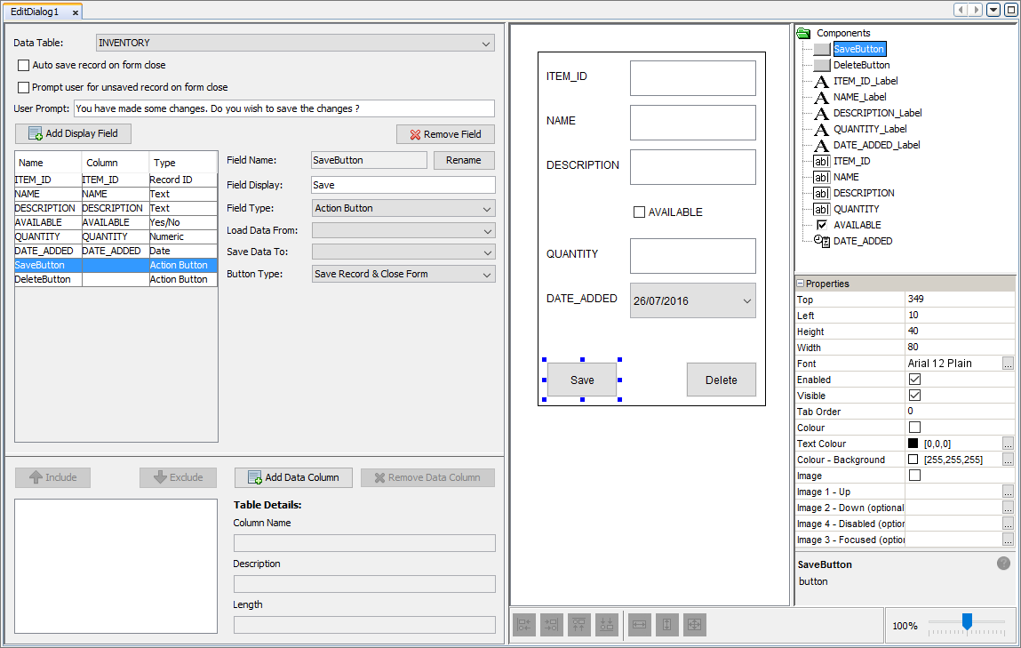
Display Fields
Once a data table has been binded to the dialog, the edit dialog editor will be populated with display fields that correspond to the columns in the selected table. In the edit dialog editor, columns from the data table can be added and removed from the table definition. Also columns can be included or excluded from the form.
Additional fields maybe also be added, which may be used within the form to capture and/or display more data to the user.
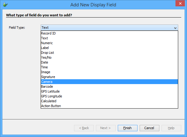
Creating a new field will display a new field dialog, where the type may be specified. This will create a new edit field with name based on the type - for example, if a Camera type is to be added, its name would be 'CAMERA1' etc.
For each selected field, multiple options will appear. These are:
Field Name: Here you can edit the name of the field. This will update the field table and the control components name in real-time.
Field Display: Allows for editing the display text in the label for the chosen field.
Field Type: A drop down menu where you can select the field type of the field. The type will dictate the functionality of the field and the controls required. The controls needed will be automatically added to the form and shown in the WYSIWYG window. For more on field types refer to the Field Types section below.
Load Data From: By setting this option to a column in the data table, if the form is opened to modify or view a record in the data table, the initial value shown will be loaded from that column. The record that will be loaded can be set through editing the form link when setting the opening context of the edit dialog, sin which you can provide the unique record identifier to be searched for.
Save Data To: Setting this to a column in the data table will save the data in the fields controls into a new record when the 'Save' button is pressed.
When adding fields, except for the 'Yes/No' type, it will have a identifying label named as '<FIELD NAME>_Label' and every field will have a data control where its data is stored named with the field name. The form values for the dialog will be all the data controls for each field. Form value names will be in the form of '<DIALOG_NAME>.<FIELD_NAME>'. For information about what each form values are available for each type are stated in the 'Field Types' section below.
Field Types
Each field in the edit dialog will have a type indicating what data can be stored in the field. When assigning the type, the WYSIWYG window will update with the controls associated with that types. For example a field with type 'Camera' will add a label, scribble and button control to the form.
By selecting a component on the WYSIWYG window, its properties will populate the properties window where the user can alter its properties. Certain types will display additional options which may also be set.
| Field Type | Description | ||||
| Record ID | A type to indicate the field is the unique
identifier for a record. These should be used when
viewing or adding a new record into the data table. Hence
the 'Load Data From' and 'Save Data To' properties should
be set to the unique record identifier of the bound data
table. A new option will appear to the user where they
can indicate the type of the record ID. These types include:
By adding a field of this type, it will automatically add a label and edit control to the form. This field is designed for ID fields which must be generated on the form. If a constant or contextual value is to be used, this field should be set as a Calculated field. 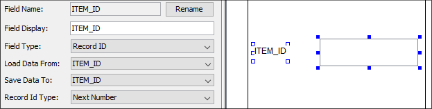
|
||||
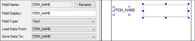
| Text | Assigning a field the type of 'Text' means the field
will accept text
into the edit control. Fields of this type should be used
when user input in the form of text is required. The 'Text'
type will add a label and a edit control to the form.
|
||||
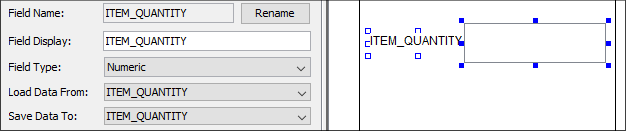
| Numeric | Assigning a field to the 'Numeric' type dictates the
edit control added to the form will accept
integer values. This type will automatically
add a label and a edit control. The edit control added
will have its 'Number' property ticked indicating the
control will only accepts numeric entries.
|
||||
| Label | By selecting the 'Label' type, it will add
two labels to the form. Where the <Field
Name>_Label control will be used to identify
the other/data label where data can be entered. (E.g.
Field Name = 'LABEL', identifying label will be name 'LABEL_label'
and the data label will be named 'LABEL'). A field with
label type will should typically be used for displaying
data. 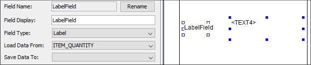
Label field types will have no form values. |
||||
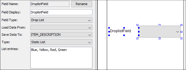
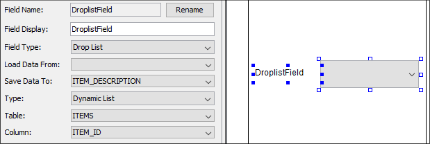
| Drop List | This type indicates the field will be a drop
down list where users will be able to choose
an entry from the list shown. By adding this field,
a label and a combo box control will be added. There are
2 types of drop list fields, static
and dynamic.
These types dictate where the items of the list will be
produced from.
|
||||
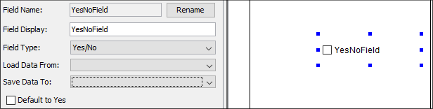
| Yes/No | This type will add a check box control to the form.
The check box will be used to indicate yes
or no where if the check box is ticked indicates
yes and unticked for no. Another option will appear that
will allow the default value of yes (i.e. the check box
is ticked initially).
|
||||
| Date | The purpose of the 'Date' field type is to allow input
in the form of dates.
In order to set the format of the date, the user will
be able to set the 'Date Style' through the drop down
menu available. The available styles are:
The 'Date' type will add a label and a DateTime Picker control. 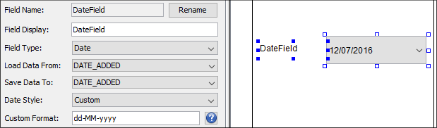
|
||||
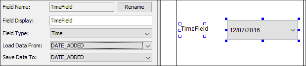
| Time | The 'Time' type will add a label and a DateTime Picker
control where the user can set
the time to be entered into the DateTime
Picker control.
|
||||
| Image | By setting the field to the 'Image' type will add a
label and a image control
to the form. By clicking the  button,
the user has the ability to set the image to be shown
in the image control. However the image binary can be
loaded from a data column by using the 'Load Data From'
option. button,
the user has the ability to set the image to be shown
in the image control. However the image binary can be
loaded from a data column by using the 'Load Data From'
option.
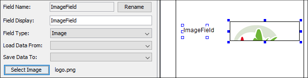
Field types with the 'Image' type will have no form values. However the image control's value are available within the local scope of the form found when used in a calculated field under 'This Form' branch of the data source.. |
||||
| Signature | The 'Signature' type will provide controls to the form
allowing users to enter
and capture signatures. A label, signature and
button control will be added. The signature control is
where the user can enter signatures while the button control
will be used to allow users to clear the data in the signature
control.
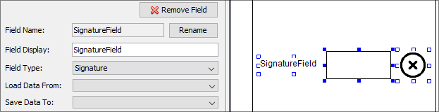
Similarly to the image field type, signature types will have no form values however the signature control value is available within local scope of the form. Hence the signature control can be used within a calculated field. |
||||
| Camera | Assigning a field to the 'Camera' type will allow the
user of the application to open
the camera and capture an image. By adding a field
of this type will add three controls, a label, a scribble
control and a button control. The button control will
facilitate opening the
camera interface on the device to allow capturing
of an image. The scribble control will house and display
the image captured from the camera. The users also
have the ability to 'Allow
Markup' where the captured image can be marked
on. 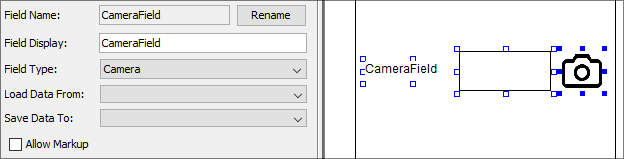
The camera type has no form values. The signature control added to the form however can be used within the local scope of the form. |
||||
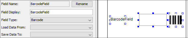
| Barcode | By selecting the 'Barcode' type for a field will add
a label, edit control and a button control to the form.
These controls will be used to provide barcode scanning
to the application. Before using this functionality a
barcode scanning application must already be installed
on the device. Using the button provided, users will be
able to open the barcode scanner application installed
on the device in order to capture barcode data and save
it into the edit control.
|
||||
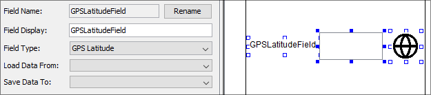
| GPS Latitude | The 'GPS Latitude' type is used to capture the current
latitude coordinates using the GPS capabilities available
on the device running the application. By pressing the
button that is added automatically, the current latitude
coordinates will be saved
into the edit control. GPS services should be enabled
on the device.
|
||||
| GPS Longitude | Similarly to the 'GPS Latitude' type, the 'GPS Longitude'
type is used to capture the current longitude coordinates
using the GPS services available on the device. The type
will add three controls, a label, edit control and a button.
When the button is pressed, the current longitutde coordinates
will be added to the
edit control. GPS services should be enabled
on the device. 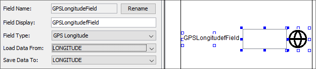
|
||||
| Calculated | The 'Calculated Phrase' type will indicate the field
is a calculated phrase. A calculated phrase is a mathematical
expression that be created from form values available
from all forms in the application, settings available
in the application and constants and objects made available
by BrightBuilder. By click the calculated phrase box will
open the 'Calculated
Phrase Editor' window that will provides
users the ability to formulate their phrase.
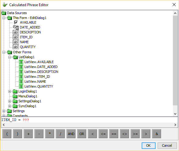 The window provides the data sources that can be used to formulate the phrase:
By dragging and dropping these data sources and the mathematical operators available into the statement line, the phrase can be constructed. A Calculated Phrase field will add a label and a edit control. When the form is opened, the edit control will be instantiated with the value obtained from the calculated phrase.
|
||||
| Action Button | A field with this type will add a button control to
the form. This button will be used to carry out an action.
In order to use this type, the buttons type must be set.
The button can be assigned these types:
|
 button,
a help window will appear detailing the rules and
available format strings that can be used in the custom
style.
button,
a help window will appear detailing the rules and
available format strings that can be used in the custom
style.