
Simple Contact List Application
Contents Hide
Description
This section will describe how to create a simple application that will have the ability of displaying and storing a list of contacts. The application will have the ability to add new contacts to the list and be able modify existing contacts. Deletion of existing contacts can also be done through this application.
Create the BXP Project
To start development of the application, first create the BXP project. Either:
Click on the New icon
 in the BrightBuilder toolbar or Projects panel, or
Select File>New Project... from the Main Menu
The New Project-Select Project Type dialog will display as shown below.
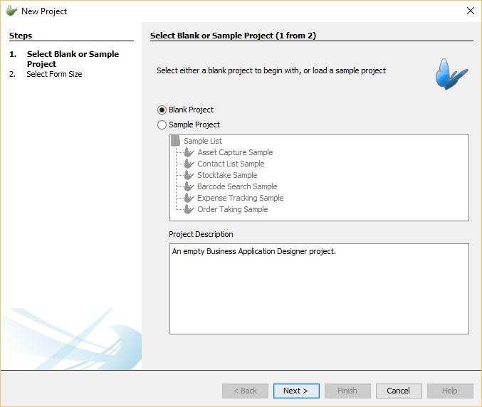
Follow the prompts shown in this dialog, creating a blank project with desired form size. Name the project in the desired directory and click 'Create'.
List Dialog
A list dialog will be used in order to provide the application the ability to display a list of contacts. This dialog will be the main form dialog meaning it will be the first form dialog to be shown when the application is opened. The list dialog will also be used as the entry point to the other form dialogs of the application in order to carry out more functionality such as creating a new contact.
Once the project has been created, open the project's tree and open the 'Application' element to open the Application panel. In the Application panel, drag and drop the list dialog icon onto the Application canvas to create a list dialog node. By right-clicking the list dialog node, the option to 'Rename' the dialog node can be done. Double-clicking the node will open the specific list dialog node editor.
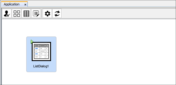
The list dialog has the purpose of showing data records from the specified data table in a listview control. As the dialog and project is brand new, there will initially be no data tables to be used. From the list dialog editor, the data table definition can be created and selected. A data table is a table that will contain the data used within the application. These tables are essential to an application if data is to be stored as they will be used on the device to hold the data and be used for synchronisation for sending and receiving data. They are a collection of data about a specific topic, such as items or employees.
To create a data table, use the data table drop down and select '<New Table...>'. By selecting this option, the Create Table window will appear where the name of the data table and its data columns can be specified. For this application name the data table 'CONTACTS' and add a unique record identifier with type 'int'. Additionally add data columns for the first name, last name, phone number and date of birth of the contact. Add these data columns with appropriate names, descriptions and types. After doing this, your table definition should look similar to the image below.
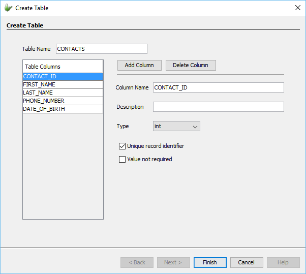
By pressing the 'Finish' button and if the table definition is valid, the table will be created and automatically selected as the dialogs data table. Once the data table has been set, the listview control in the dialog will be populated with the data columns from the data table. A WYSIWYG panel is used within the editor to show how the form will look like on the mobile device. Through this panel, the visual components can be changed to accommodate to how the form is desired to look. By clicking each component, the Properties panel will be populate with its properties where they can be edited. These components should be placed within the form bounds (i.e. black rectangle box).Through the list columns panel, the columns to be displayed in the listview can be edited and the columns header text to be displayed and the width of the column within the listview can be changed as well.
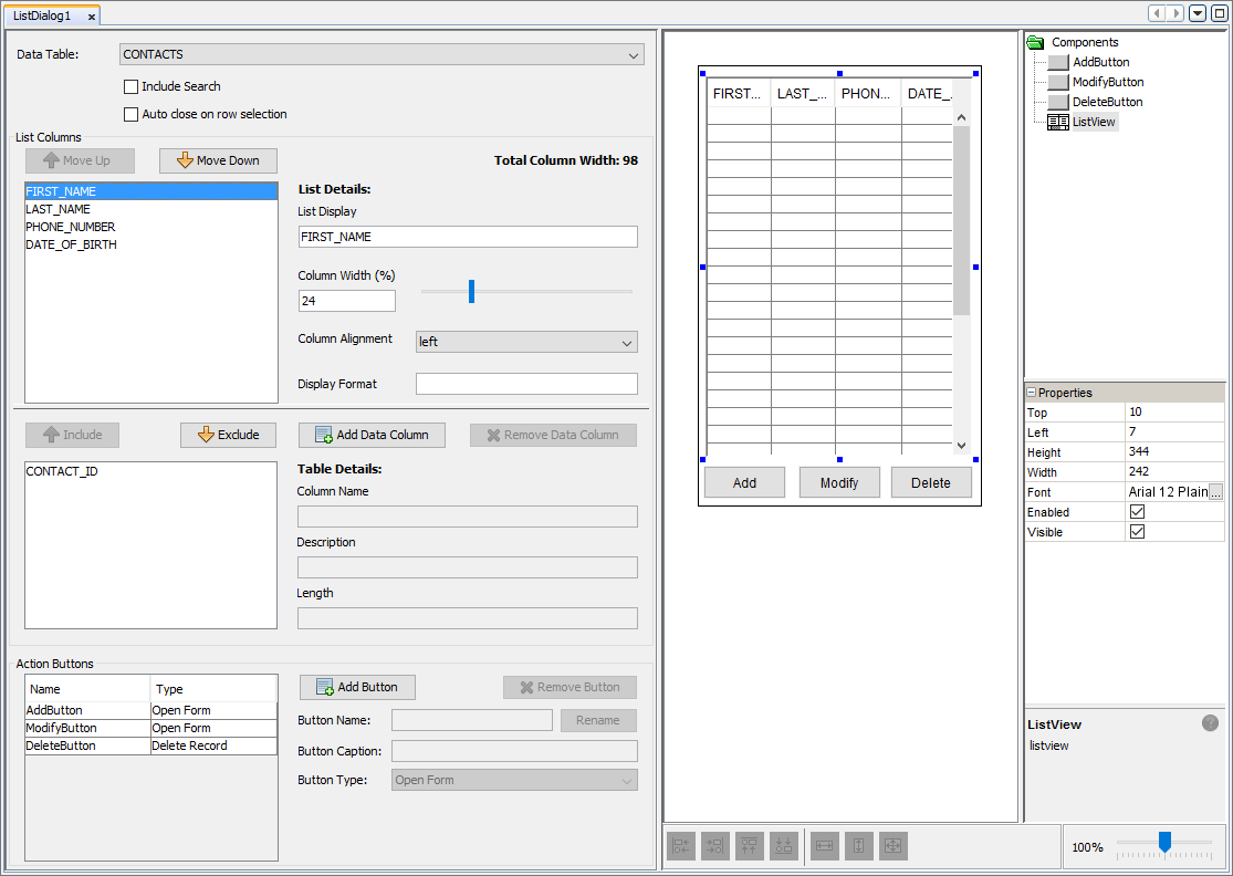
By default every list dialog will contain three action button. One button for adding a new contact into the list, one for modifying an existing item and another for deleting an existing item. In this application we will set the add and modify button to open an edit dialog hence their button type is 'Form Link'. To set the functionality of the Add and Modify buttons refer to the Create Form Links between List and Edit Dialog section.
For more information on List Dialogs, refer to the List Dialog chapter of the Form Dialog section.
Edit Dialog
Next we will add an edit dialog to the application. Edit dialogs are used to modify a data tables contents (i.e. the data within the table). An edit dialog can add new records to the table or modify an existing record in the data table. An edit dialog can also be used to view a record in the data table in a read-only mode disallowing any editing of the data.
An edit dialog can be added to the application by dragging and dropping the edit dialog icon from the dialog toolbar into the application canvas. The purpose of this dialog is to provide a form that can be opened in multiple contexts. One context is for adding new contacts into the contact data table, another for modifying an existing contact record in the data table and one more for viewing an existing contact record from the data table in a read-only mode (i.e. the data in the record cannot be changed).
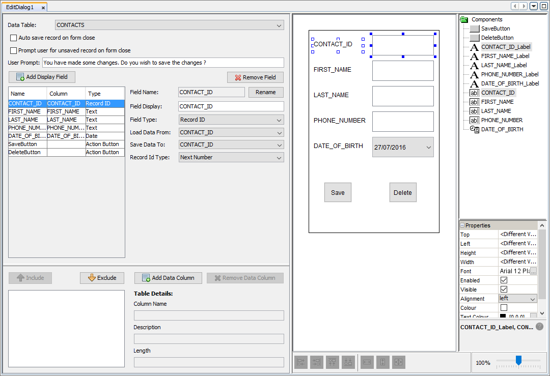
Within this section we will create the dialog ready for data entry from the user. By double-clicking on the edit dialog node, the edit dialog editor will open where firstly the data table should be set. The data table indicates the fields that will be added to the dialog. By selecting the CONTACTS data table, the dialog will then be automatically populated with fields corresponding to the data columns and their specified type. The form will be populated with controls that will allow for user input (i.e. a column with dateTime type, will add a field with type date that includes a dateTimePicker control). Another automatic feature is through the addition of save and delete buttons added to the edit dialog. The save action button has the purpose of saving the record into the data table and the delete button will become active if the edit dialog has been opened with the context of modifying an existing contact. To complete the dialog, simply add another display field with type 'Action Button'. The newly added action button will be used to close the form dialog and return to the list dialog. The button can perform this functionality when pressed by setting the Button type as 'Close Form'.
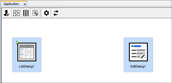
Now we have 2 dialogs, a list dialog for viewing the list of contacts and another for the creation, modification and deletion of records in the data table. For more information about Edit Dialogs, refer to the Edit Dialog section in the Form Dialogs section.
Create Form Links
Form Links are used to control the flow of the application and define what dialogs can be traversed from dialogs within the application. Essentially a form link is made of two dialogs, one is the parent dialog which will open the other dialog or its child dialog. In order for the parent dialog to open its child dialog, at least one specified action is needed, for example, tapping a specified button could be the action required for the parent dialog to open its child.
For this application, the list dialog should open the edit dialog in order to create, modify or view a contacts details from the data table and to do this, a form link should be created. Form links can be created by first selecting the parent node and holding the 'Ctrl' button. While holding the 'Ctrl' button, select the parent node again through left click of the mouse and hold the button. By dragging the mouse to the intended child dialog while holding the 'Ctrl' and left click buttons, a form link is created which is visually reinforced through the directional arrow shown. The child dialog is the dialog connected to the arrow with the arrowhead pointing towards it and the dialog on the other end is the parent dialog. Create a form link from the list dialog as the parent dialog and the edit dialog as its child dialog resulting in something similar to the image below.
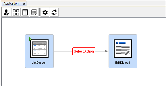
However the form link is not complete. The action that needs to
be performed within the list dialog has not be specified. Initially
we will create the form link with an action to open the edit dialog
with the context of creating a new contact in the contact list. To
do this, double click  to open the form link editor. The window will show all the possible
actions that can be done to open the child dialog. For this example
application, we would like the edit dialog to open when the 'Add'
button is pressed. Once the action has been set, the edit dialog will
need to be provided with more information to detail the context it
should be opened. Since edit dialogs can be flexible in how they are
opened they can be opened with numerous contexts to provide more functionality
to the application. In this case, we want the edit dialog to be opened
to create a new contact in the data table.
to open the form link editor. The window will show all the possible
actions that can be done to open the child dialog. For this example
application, we would like the edit dialog to open when the 'Add'
button is pressed. Once the action has been set, the edit dialog will
need to be provided with more information to detail the context it
should be opened. Since edit dialogs can be flexible in how they are
opened they can be opened with numerous contexts to provide more functionality
to the application. In this case, we want the edit dialog to be opened
to create a new contact in the data table.
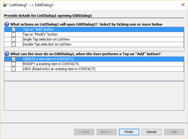
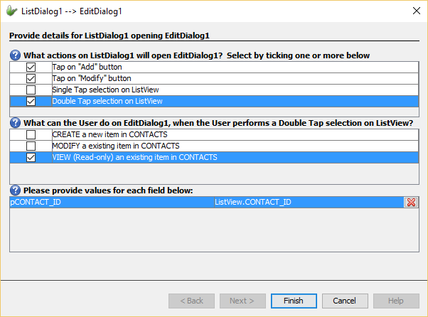
A form link can also be specified with more than one action to open its child dialog adding more functionality and direction in which the application can take. Other than adding new items to the contact list, the application should be able to modify existing contacts in the list. Through form links, this can be performed by adding another action to the form link. By simply opening the form link editor and ticking another action within the list of actions, tjhat action will be added to the form link. The newly added action can be given other contexts in which to open the child dialog. However some contexts require more information to be able to open the child dialog with that context. For example, to modify an existing item in a data table, the item to edit must be specified. When a context requires more information, the editor window will be updated with the required values that need to be provided in order to open the dialog with the given context. By clicking on the field value, the 'Choose a Parameter' window will appear where the value to be used to specify the extra information required (e.g. value to match unique record identifier) can be set.
To add more functionality to the application, add multiple actions to the application in order to modify the currently selected items in the contact list and to view an existing record in the edit dialog in read-only mode. Form values can be used here to specify the required contact's unique record identifier should equal the currently selected items unique record identifier. For more information refer to the Form values section. The form link editor should look similar to the image below.
Form links allow the flow of the application to be specified in a visual representation allowing for ease of use without any programming. Through form links we can detail how the application can be explored by a user in a simple and easy way. By adding form links our application is complete and ready to be deployed and released onto devices.
Refer to the Form Links chapter for more information.
Publish and Run Application
Once the application has been developed, the application can be published to the server and devices can connect to this server and be distributed with the application. For this example application, BrightServer will be used to publish our application. The BrightServer simplifies the process of publishing applications onto the server and deploying them to devices. Through a simple button press, the project and the user details that will need to be entered into BrightForms can be generated automatically. These login details will be used to validate the user of the app and allow the latest published app to be deployed onto the mobile device.
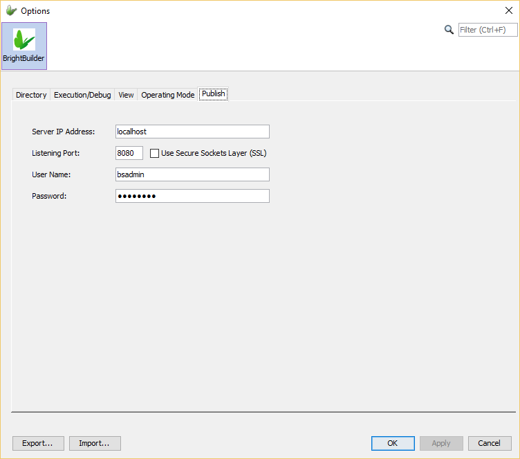
Before publishing applications to the BrightServer, a BrightServer instance should be currently active and its details should be entered into the BrightBuilder options. The purpose of the Publish options is to specify the default server values for a BrightServer instances. These options can be accessed through the 'Tools' menu in the top menu of BrightBuilder and pressing on the 'Options' submenu item. The BrightServer settings can be found under the 'Publish' tab where the required details for the BrightServer such as the server IP address can be edited. These settings should point to an active BrightServer instance currently running.
By simply right-clicking the BXP project and pressing 'Publish', the project will be validated to check for any compilation errors. If errors exist within the project then publishing will fail and the 'Output - Validation' window will list all errors within the application. If the validation passes and no errors are found, the 'Publish Project' wizard will open to step through all necessary steps required for the project to be published correctly. The first step involves confirming the server details that the project will be deployed to. Initially when it is opened, the wizard will be populated with the default server details specified in the Options window of BrightBuilder. Details of a currently active BrightServer should be entered as these details will be used to publish the project.
In the next step, requires specification of the elements within the BXP project that will deployed. Since we are using the BrightServer only the option to 'Deploy Application with description' is available. When this option is ticked, the project with the Application element will be deployed onto the server which is exactly the functionality that is required here as the project does not require synchronisation between client and server data sources. The 'Deploy Data Flow with description' option should be used when the project to be published requires synchronisation and hence the project would need to be published onto a BrightServer.
The last step is an optional step where other files can be uploaded to the server alongside the published project. In this example project, no other necessary files are required to be uploaded. By clicking the 'Finish' button another window will appear to inform the result of the deployment. If it was successful, then the window will display the required login details to be entered into the BrightForms app for devices to connect to the server and be distributed with that published application.
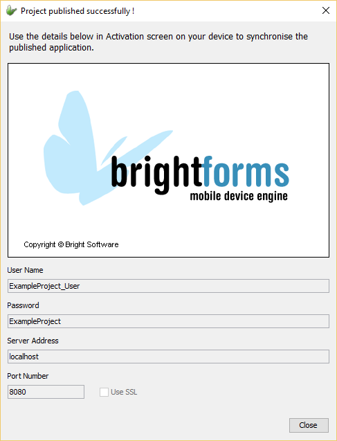
Once the required credentials are entered into the BrightForms app, the application will be loaded onto the device and run through the BrightForms app. Once it has been loaded the application can be used. However if multiple devices are required to be connected to the BrightServer and have access to applications hosted on the server, a license is required.
This simple example has shown how easy and simple it is to develop and publish mobile applications without the need for any programming experience. Through the BXP project designer and BrighServer, mobile application development has never been easier.