Forms
Contents Hide
- Creating a new form
- Opening an existing form
- Renaming a Form
- Deleting a Form
- Form Layout and Controls
- Tabs
- Forms and Data Binding
- Loading Data
- Validation Rule and saving data
- Form Variables
- Menus
- Expressions
Forms are used for a variety of purposes, to enter data into a table, to display records from the database, to accept user input and carry out an action based on that input, or use form controls to open other forms. A form is the heart of the graphical user interface of Bright Applications.
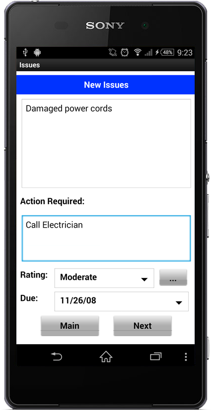
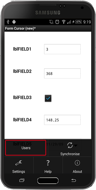
An example of a cursor form with many form controls is shown above. Note the cursor bar at the bottom which provides buttons to create new records, save records, delete records and navigate the record set.
Graphical objects called controls are used to create a link between the form and its data/record source. Forms can be customised to suit the type of information that is being worked on by using these controls. The controls that are available include:
Labels
Edit Controls
Buttons
Combo Boxes
List Views
Radio Buttons
Check Boxes
Date Time Picker
Group Boxes
Images
Scribble
For a complete discussion on form controls, go to Form Layout and Controls.
BrightBuilder forms are treated as a series of modal forms. The parent form is displayed initially and a child form can be opened through this parent form. Once a child form is opened since it is modal in nature, it is not possible to access the parent form while the child form is open. Think of it as Last-In-First-Out (LIFO) form navigation. Or in other words, think of it as a deck of cards in which it is only possible to open and play with the top card. There is also an option for you to create non-modal forms using the different methods available in the Form Object of the Data Source tree.
A child form can also be a parent form such that it can open another child form. Forms can be opened through form or form control actions.
Data passing from parent to child form is through the use of the OpenForm dialog in the form controls Action -(event) properties. Another way to pass data to the child form is by using an expression.
While data passing from child to parent form uses the Form/Result property. The child form sets the result property and the parent form may access the result using a Post-close expression. Read on to learn more on Forms.
Creating a new form
To create a new form:
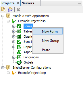
In the Projects Window, expand the project in which the form is to be added. The different project elements will come into view.
Right-click on Forms sub tree
Select New Form from the popup menu as shown in the figure below.
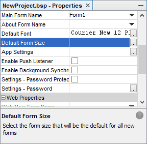
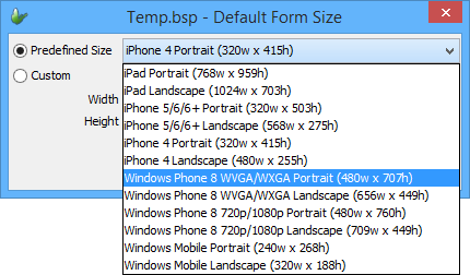
If the form is the first in the project, and the project's 'Default Form Size' property has not been set, the 'Default Form Size' dialog for the project will pop up. The selected value defines the size new forms are created in the project. It may be changed any time via the corresponding project property.
 Note: Assigning a project to a predefined form size, such
as 'iPhone5 Portrait' or 'Windows Phone 8 WVGA/WXGA Portrait'
will create the form with the target device's image applied.
If no device exists for the specified resolution, a generic
device skin will be assigned. For more information on device
skins, please refer to the Using
Device Images section of this chapter.
Note: Assigning a project to a predefined form size, such
as 'iPhone5 Portrait' or 'Windows Phone 8 WVGA/WXGA Portrait'
will create the form with the target device's image applied.
If no device exists for the specified resolution, a generic
device skin will be assigned. For more information on device
skins, please refer to the Using
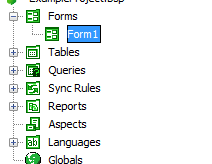
Device Images section of this chapter.Expand the Forms sub tree to verify the addition of a new form; it will also be automatically opened in the Editor window.
A new form will appear under the Form sub tree with default name, Form1 or Form# depending on how many unnamed forms exist in the Form sub tree. Refer to the Figure below.
After creating a form, it is still possible to change any of the form properties like fonts or form size; it can also be renamed to a suitable name that describes the nature of the form. If unsatisfied with the form or if its no longer wanted then it can simply be deleted.
 Each project has a Main Form Name property which determines which
form is opened when the application is started. When the first
form is created, it will automatically become the Main Form for
the project.
Each project has a Main Form Name property which determines which
form is opened when the application is started. When the first
form is created, it will automatically become the Main Form for
the project.
Opening an existing form
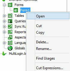
Existing forms can be opened for modification or to simply view the form characteristics. When a form is opened, it will dock itself to the Source Editor view. To open a form, do any of the following:
Double-click on the form name
OR
Right-click on the form name and select Open from the popup menu, refer to the image below
Changing Form Properties
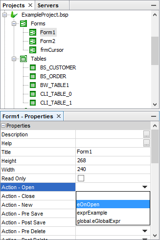
Form properties can be changed to specify the appearance, attributes and behaviour of a form. To change the properties or attributes of the form:
Select the form under the Project\Forms tree, the properties will be listed in the Properties window
Select the form property by clicking on the right hand side of the property name.
Type an entry or select from the options.
Form Properties
The following table is a list of the form properties and a brief description:
| Property | Description |
| Action - Background Sync | Specifies an expression for when the Background Synchroniser completes a session. |
| Action - Change Tab | Specifies an expression to be executed when the form tabs are clicked. |
| Action - Close | Specifies an expression, which is triggered when the form is closed. |
| Action - Gesture | Specifies an expression for when a user performs a gesture. |
| Action - New | Specifies an expression, which is triggered when the user clicks on the New button on the cursor bar. |
| Action - Notification | Specifies an expression to be run when the system notification event occurs. |
| Action - Open | Specifies an expression, which is triggered when the form is opened. |
| Action - Orientation Changed | Specifies an expression which is triggered when the screen orientation has changed. |
| Action - Post Delete | Specifies an expression to be executed after a record is deleted in a cursor form. |
| Action - Post Save | Specifies an expression to be executed after saving a record in a cursor form. |
| Action - Pre Delete | Specifies an expression to be executed before a record is deleted in a cursor form. |
| Action - Pre Save | Specifies an expression to be executed before saving a record in a cursor form. |
| Action - Push | Specifies an expression for when unsolicited push data is received. |
| Action - Scan Complete | Specifies the expression to be executed once a barcode scan is complete. This can only be used with a Symbol or an Intermec device. |
| Action - Timer | Specifies an expression to be executed when the timer elapses. Useful for automatic synchronisation with the server. Use EnableTimer() and DisableTimer() form objects to start and stop the timer. |
| Colour | Enables the form background colour. |
| Colour - Background | Sets the form background colour. |
| Colour - Text | Default form text colour |
| Height | The vertical dimension of the form expressed in pixels. |
| Help | The text to include in the Help dialog attached to the form. |
Hide Menu Bar |
Set to true to hide the menu bar. |
| Hide Title Bar | Set to true to hide the title bar. |
| Image-Filename | Specifies the file containing the image to be used in the form background. |
| Image-Style | Specifies whether the background bitmap should be centered, stretched or tiled. |
| Maximised | Specifies whether the form will initially appear maximised. |
| Notification-Delay | The number of milliseconds to wait between the event and the notification. |
| Notification-Event | The notification event that will trigger the Action-Notification expression. |
| Read Only | Determines whether values/settings on the form can be changed or not. True or False. |
| Tab Font | Determines the font of the text that will appear on the tab attached to the form. |
| Timer Interval (ms) | The timer period in milliseconds. |
| Title | The name that will appear on the form title bar. A text string. |
| Width | The Horizontal dimension of the form expressed in pixels. An integer. |
| Web Hide Home Link | Removes the option to return to the home screen from the form in the web application. This may need to be used to maintain the application state as non-web solutions. |
| Web Hide Logout Link | Removes the option to sign out from the form in the web application. This may need to be set to be used to maintain the application state as non-web solutions. |
| Web Hide Close Link | Removes the option to close the form in the web application. This may need to be set to be used to maintain correct execution, given the web platform. |
| Window Mobile - Has Scroll Bars | Instructs to show vertical and/or horizontal scroll bar if the form is bigger than the actual device size. This property is applicable to Windows Mobile platform. Ignored on other platforms. |
Note: The Help dialog can include white spaces and carriage
returns to help format the text. The content does not have
to be a simple string. Make sure that each Help screen is
tested before the application is deployed. BrightForms Help
option is discussed in details in BrightForms Chapter 2.
More form properties are available through expressions and are contained in the Data Source Tree. These include CanAdd, CancelClose, CancelDelete, CancelOpen, CancelSave, CanDelete, CanModify, Result and Title. For descriptions on these see the section Form in Chapter 16 - More on Expressions.
Renaming a Form
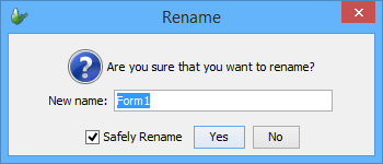
As said before, it is recommended to have a consistent naming convention within the project. This is also true for the forms. Name the forms to describe what they do in the project. If Form1 is the main form to open upon execution, it would be appropriate to rename Form1 to MainForm.
Here are the two ways to rename the form.
Click on the form name i.e. Form1 until it is editable, type the new form name and press ENTER
Or, use the popup menu when right-clicking the form name and select Rename, a Rename dialog box will appear. Enter the new form name in the New Name field and click Ok or press ENTER.
In the Rename dialog box below, the previous form name is displayed in the New Name field to allow users to append text to the word Form. This is true for all project element renaming.
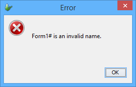
A valid form name begins with a letter and may be followed by
letters, digits, and underscore sign ( _ ), and must not contain
more than 64 characters.
When an invalid name has been entered, BrightBuilder will issue a warning message like the one below and will not allow the form to be renamed; it will use the last valid name for the form.
Deleting a Form
The steps in deleting a form are the same in deleting a Project though instead of highlighting or selecting a project, an existing form must be selected. As a review,
Right-lick on the form name
Select Delete from the pop-up menu.
And confirm deletion by clicking Yes or pressing ENTER in the Confirm Object Deletion dialog box. If the form is referenced within the BSP, and the 'Safely Delete' option is set to true (default), an additional verification dialog will appear to confirm the deletion.
Form Layout and Controls
To create a form, first visualize how it should look. It wouldn't be a bad idea to sketch a layout for the form first or use an existing form as a guide for your design. Once this is done, the following BrightBuilder features will help layout and build the form.
Use the graphical user controls such as labels, edit controls, combo boxes, list views, buttons, radio buttons, check boxes, date time picker, group boxes, and images. All these controls will be discussed in greater detail in the next section.
Use the built-in form functionalities for data-binding, data validation, variable creation and expression construction.
BrightBuilder uses drag and drop to place controls in the form layout. Control attributes can be modified to suit the application. With the different built-in functionalities, BrightBuilder makes it easy to use by providing the information; the user simply needs to choose from the list.
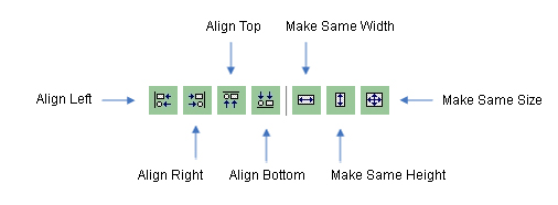
Multiple controls can also be selected and dragged, aligned or resized using the alignment and resize buttons at the bottom toolbar of the Form Layout tab.
Cut, copy and paste of form controls is also available within the project.
Form sizes can be customised allowing applications to be created
to fit any target device's screen size. Also with the use of Aspects,
projects can be created to run for multiple screen orientations
on multiple devices. When there are multiple aspects, the BrightForms
client will determine the best fit during runtime.
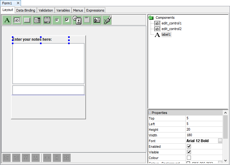
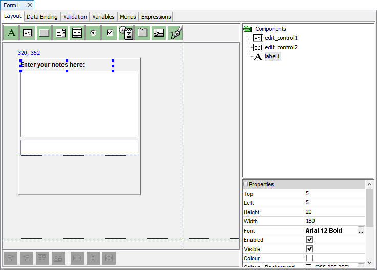
The image below is a form with its different tabs and controls.
The PDA Soft Input Panel (SIP) Line
To aid PDA form development, when the form size is set to the default, a blue line is visible to represent where a SIP keyboard would cover up to. Anything below this would not be visible when the SIP keyboard is being used. If the form is not using the default size i.e. Width = 240 and Height = 268, the SIP line will not display because it is assuming that the form you are creating is not for the PDA size.
Resizing a form
New forms are created based on a project's Default Form Size property. If this value has not been populated for a project, the Default Form Size dialog will appear when a new form is created in the project, setting this Default Form Size value.
The Width and Height form properties may be used to resize the form layout. Alternatively, resizing the form may be performed by dragging the form boundaries to the desired size. The figure below displays form resizing by dragging the bottom right corner of the form, this will resize both the width and the height of the form. Both the Width and Height form property will also be updated when the form is resized by the drag method.
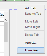
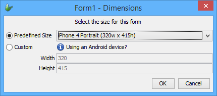
Finally, right clicking outside of the form's layout and selecting 'Form Size ...' will bring up the form size dialog to specify new dimensions. Predefined device and aspect sizes are also listed for selection in this menu.
Applying Aspects
When first creating a new form, the layout created will be for the size for the base aspect of the project. After creation, new aspects may be defined by right clicking outside of the base aspect's form area, and selecting the 'Aspects...' option to open the 'Enable Aspects' dialog.
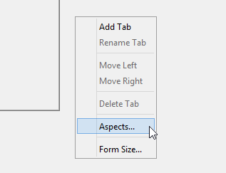
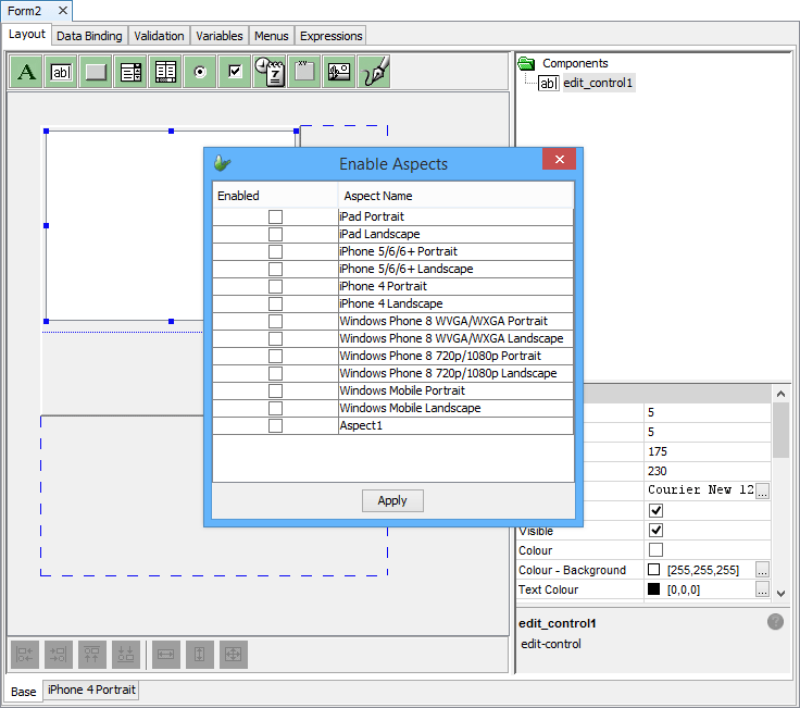
Through this dialog, any default or project defined aspects may be applied to the layout. Initially the controls for newly created aspects will have the same size/position as the base aspect, and may then be freely modified. Aspects may also be cloned from one another, by right clicking outside of an aspect's layout, and selecting 'Clone Aspect'.
For more information on a project's aspects, please refer to the BrightBuilder > Form Aspects chapter of this document.
Using Device Images
Device images are applied to any new form or layout created, based on the project's Default Form Size property. This gives an accurate proportional mockup of what the designed layout will look like on a given target device. By default, based on the layout's screen size, the most suitable device image will be used.
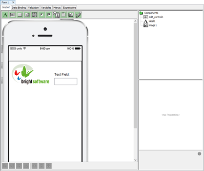
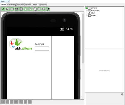
If the size of the layout does not match any predefined layouts, a generic layout will be used.
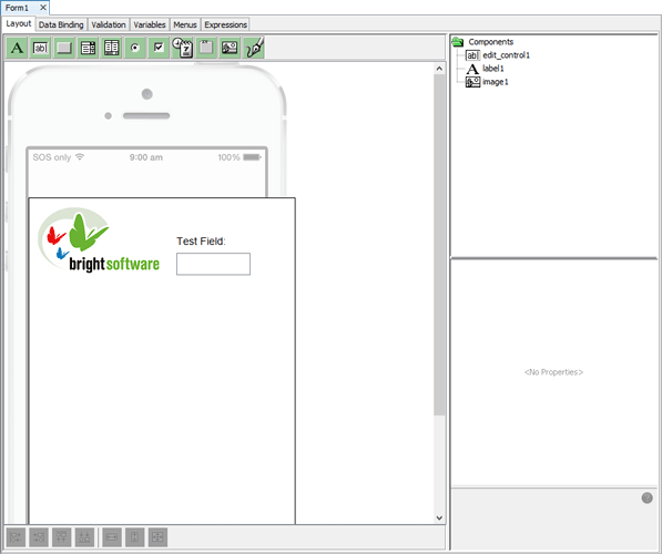
This setting may be toggled on and off by right clicking outside of the form layout and selecting 'Show Device Image'. If toggled off, it will remain off for any aspects created from the base or cloned aspects across all layouts in BrightBuilder. The actual skin displayed may also be changed via 'Select Device Image'.
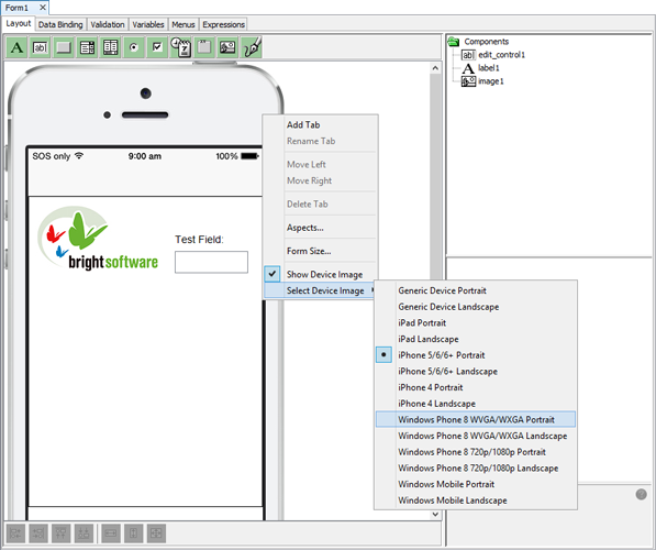
While editing, if the form or aspect size is greater than the bounds, the skin will be dimmed, indicating that the area is too large for the target device. Similarly, if there are controls out of the device's bounds, the skin will also dim, highlighting this state. This will not occur for the generic device skin, as it is designed to suit any layout.
Grid Lines and Snap to Grid options
You can use the Display Grid Lines and Snap to Grid options to show the faint grey grid lines on your forms and reports. These grid lines will not display when you execute your mobile application or print your reports, they're just there as a guide for you when creating your form or report layout.

You can change the View settings from the Tools > Options menu, this will display the Options dialog as shown below.
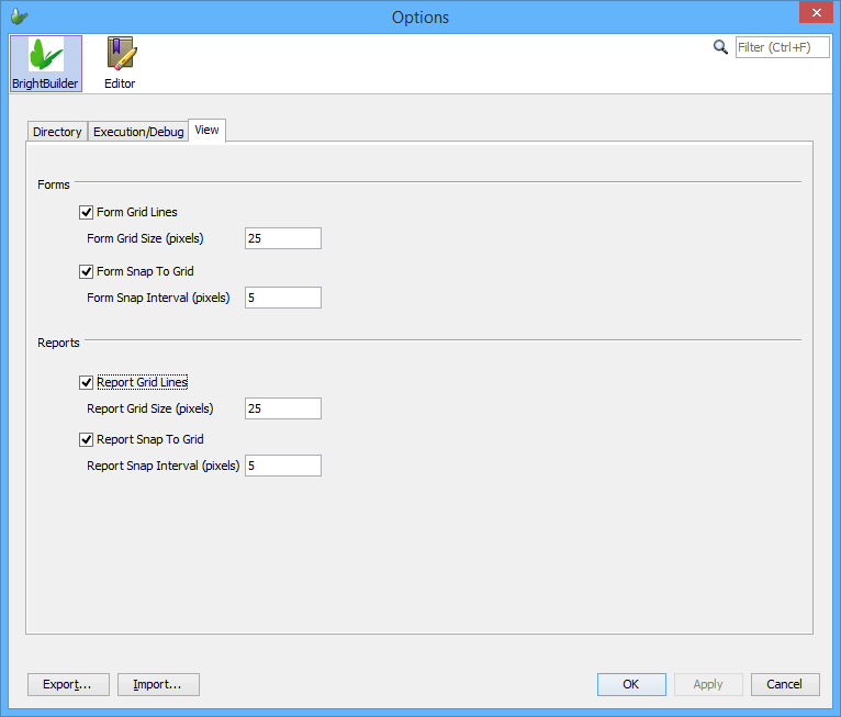
Select the View tab to list the View settings that you can change, namely:
Form Grid Lines - Checkbox to indicate if the grid lines are to be displayed on the form layout editor.
Form Grid Size (pixels) - The interval between each of the form grid lines. Valid values are positive integer values greater than zero (0).
Form Snap to Grip - Checkbox to indicate if form controls are to be snapped to the grid.
Form Snap to Grid Interval (pixels) - An integer value that denotes the interval between snap to grid of the form layout. Valid values are positive integers values greater than zero (0).
Report Grid Lines - Checkbox to indicate if the grid lines are to be displayed on the report layout editor.
Report Grid Size (pixels) - The interval between each of the report grid lines. Valid values are positive integer values greater than zero (0).
Report Snap to Grip - Checkbox to indicate if report controls are to be snapped to the grid.
Report Snap to Grid Interval (pixels) - An integer value that denotes the interval between snap to grid of the report layout. Valid values are positive integers values greater than zero (0).
Form Controls
Here are the following lists of controls with a brief description of each available in BrightBuilder:
Labels for static text appearing on the form
Edit Controls Enables the user to view, type, or edit a text field.
Buttons Initiates an action when clicked
Combo boxes Allows the user to select an option from a list and/or (if enabled) type text into the field. The list can be fixed or a query output.
List views Displays multiple rows of data, and can initiate an action when clicked or double-clicked. For viewing/selecting from a record set based on a query.
Radio buttons for choosing one of a set of mutually exclusive attributes (e.g. selecting gender, male or female)
Check boxes Allows the user to select or decline an option. Turns on/off a Boolean attribute.
Date Time pickers for selecting a date (and/or) time.
Group boxes Used to visually group a set of controls on the form.
Bitmaps for displaying images.
Scribble accepts and displays scribble images that can be loaded with bitmap images and can also save these bitmaps with the user scribble.
Adding a control to a form
Open the form to add a control to. The opened form will be displayed in the Source Editor window.
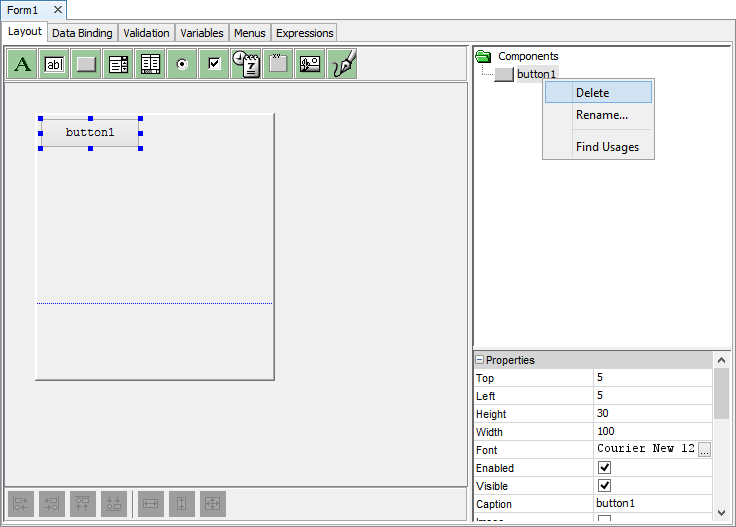
On the form Layout tab, click and drag the control icon onto the form. Once it is on the form, the control properties will be displayed in the Component panel. A new branch will also be added to the Components tree.
Using the Properties window set the properties of the control as required.
If
a control is added into a form's aspect, it will be
placed across all aspects in the position dropped.
This may not be visible, or be displaced in other
forms. It is recommended to access and reposition
the control via the components panel in this scenario.
Changing form control properties using the properties list
Each form control has property settings that can be changed to alter the appearance or behaviour of these controls. These properties can be viewed and changed by using the Property Lists of a particular control.
Select the control name from the Components tree in the Component panel of the form Layout tab; properties will be displayed.
Set each form control property by clicking the right hand side of the entry and typing an entry or selecting an option
Control properties will be discussed in detail in subsequent sections.
Resizing form controls
Click on the control that needs to be resized in the form layout window.
Drag the sizing handles until the control is the size you want.
Use the resize buttons also to make multiple controls the same width, same height or same size.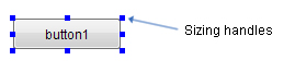
Deleting a control
Select the control from the Component panel or form layout and press the Delete key, the Confirm Object Deletion dialog box will appear.
OR
Right-click the control from the Component panel or form layout to show the popup menu and select Delete, the Confirm Object Deletion dialog box will appear.
Click Yes to confirm deletion or click No to cancel deletion.
Renaming controls
Select the control from the Component panel and then click the component after a pause to make it editable.
OR
Right-click the control from the Component panel or form layout to show the popup menu and select Rename.
Enter a new name and press Enter.
Multiple Selection
Multiple form controls can be aligned and resized.
Select the controls that are to be aligned/resized.
Use the alignment and resize buttons to perform the necessary actions.
Note: When aligning or resizing a multiple objects, the
alignments and dimensions will be taken from the control
which has the focus (i.e. the control that has focus is
resizing controls shaded in).
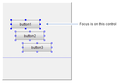
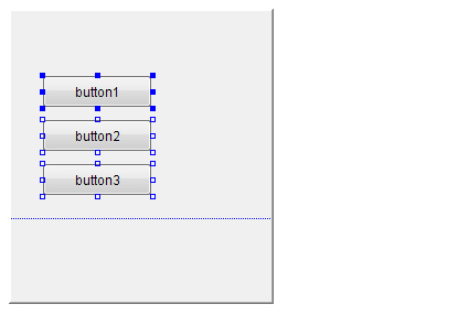
Below is the result after a align-left operation.
Tabs
Tabs can be utilised to create multiple page forms. Tabs can be used to present several pages of information as a single set. For example, a tab control may be used on an Employees form to separate general and personal information.
Tabs can be renamed, moved from left to right or deleted; by simply selecting the command from the popup menu when right clicking on the Source Editor just outside of the form layout.
Use the ShowTab method to switch between tabs upon user actions. The ShowTab(int) method displays the tab of which number is specified. Tab numbers start from 0 (i.e. the first tab is 0). The ShowTab method is accessible from the Objects/Form branch of the Data Sources tree.
Use the GetTabNumber method to return the current tab number that is on focus. With this method, once a user is on a certain tab, an Action-Change Tab expression can be executed depending on the business requirements of the application.
To add a tab;
Right-click on the Source Editor window, just outside of the form layout. This will display a popup menu
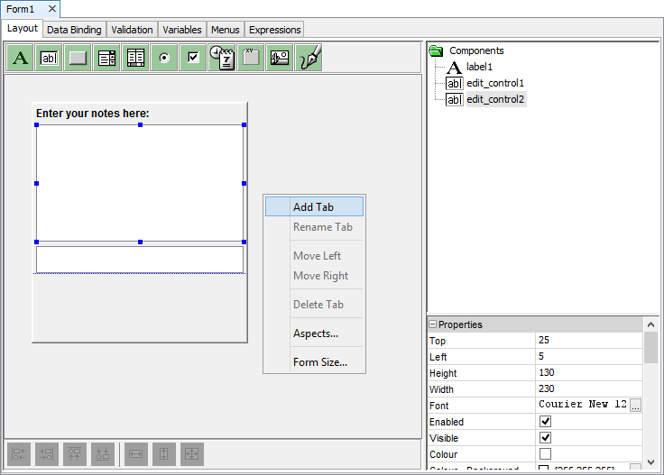
Select Add Tab from the popup menu.
From this pop-up menu, tabs can be added, renamed, moved from left to right and deleted. Just always remember to right-click outside of the form layout.
Forms and Data Binding
A form can be linked to a query. The query supplies the record source for the form, to be displayed or loaded to the controls. Based from this logic, we say that the form controls are data bound to the record set of the query.
One powerful feature of BrightBuilder is the built-in process of loading and saving records using the form Data Binding tab. Upon execution of the application project, the query linked to the form is run right before the form is opened. Therefore upon opening of the form, outputs from the query will be available for display using the data bound controls.
Once the project is run on BrightForms, whenever there are any changes made to the data bound controls, it is detected before the form is closed and a prompt will ask whether to save any of these changes, the following Save dialog will be displayed:
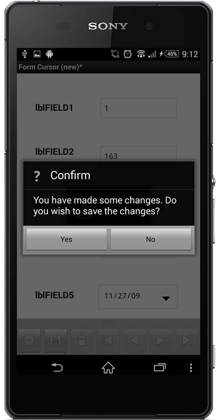
With the use of Form.EnableConfirmSaveMessage and Form.SetConfirmSaveMessage methods, you can enable or disable this save dialog or you can customise the message to be displayed on the client.
The following image is the form Data Binding tab, the cursor form can be created from here. Simply select the form query, cursor bar attributes, include columns and controls to the save and load section respectively.
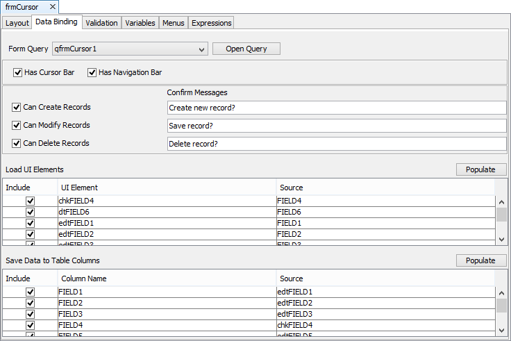
The 'Populate' button for either the 'Save Data to Data Columns' or 'Load UI Elements' tables may be used to populate matching columns from the other table, if populated.
A form can be made into a Cursor Form by enabling the Has Cursor option. A Cursor Form is useful when wanting to view, create, edit and delete a single record at a time within a record set. Cursor Forms must always be data bound i.e. each control must be tied to an output column of the Form Query.
When opening a Cursor Form in BrightForms, notice that it contains three buttons namely:
New: Creates new records in the parent table accessed by the form query. The Action-New property of the form can be used in conjunction with this button to initialize data bound controls to default values.
Save: Saves the data bound controls to the table linked with the form query when a new record is created or when changes were made.
Delete: Deletes the record attached to the form through the data bound controls.
At any point in the execution, when attempting to close a data bound form that you made some changes on without clicking on the Save button, before closing the form, the application will ask whether to save the changes that have made. This is a useful feature to control data integrity.
If a form is read-only and is also a cursor form, the New, Save and Delete icons will be disabled.
If you want to maintain the cursor position of your form after opening a child form, you can use the Form.SetJumpColumn and Form.Jump methods to programmatically refresh the cursor form and then jump back to the record you were in before opening the child form. See the example in the Object Definitions Reference Manuals for the Form object.
The image below is an example of a cursor form:
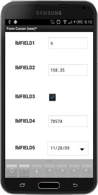
A Navigation Bar with the Cursor Form can be used to traverse the form query record set. More Data Binding concepts will be discussed later.
Loading Data
Data can be loaded into a form in a number of different ways.
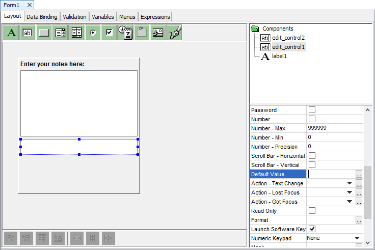
The first way is through default values. Form controls have Default Value properties which specify what value is to be loaded into the form control when it is created on the form.
The second way is through Data Binding as discussed in the previous section.
The final way is by means of form expressions. Expressions can be linked to form action events such as Action - Open and Action - New. Any expression linked to Action - Open will be executed every time the form is opened.
The Action - New event will occur in two situations. If the form is a cursor form and there are no records to load, this will automatically trigger the Action - New event. Otherwise, if the Form.New() method is called in an expression or the New button is clicked on the cursor bar, this will also trigger a Action - New event.
The order in which all these data loading events will occur in BrightForms is:
Default Values
Data Binding
Action - Open
Action - New
Each data loading event will overwrite the previous events actions if they both modify the same controls.
Validation Rule and saving data
To guarantee that the data entered is valid and error free, BrightBuilder has a built-in Data Validation function, which is performed just prior to saving data to the tables. Whether using data bound controls in the form or expressions to save to the database, the validation will always be performed. As many validation rules with its corresponding message as wanted can be created and each of these validation rule will be evaluated and if one of them fails, the message will be displayed and the save will be aborted.
For more help on the Validation Rule concepts, see Adding Validation Rules.
Form Variables
Like many applications, BrightBuilder uses the concept of variables to store data locally in the form. They can be used to accept data from the parent form or for temporarily storing data during the life cycle of the form. Each variable has a name that uniquely identifies it within the form and a data type must be specified when declaring a variable.
Variables can be assigned a value in the form expressions or in a control action-open event when the form is opened. Initial values are not required when declaring a variable.
Adding a new variable
Adding a variable is the same as creating and declaring the variable and its data type within the form.
To add a new variable, simply right click on the Variables tab grid and a popup menu will appear.
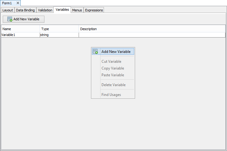
Select Add New Variable and a new variable row will appear with default name Variable1 and default data type string.
Renaming a variable
Once a variable is declared, they can be renamed to conform to project naming conventions.
Double click on the Name field of the variable; blue border indicates that the field is editable.
Delete the default name and type the new variable name.
Press ENTER to save changes to the variable name.
Changing variable type
The default data type for a variable is string. To change the data type, simply click on the Type field of the variable and select from the list of the data types from the drop-down list.
Adding a description to a variable
For design readability, descriptions for the variable can also be added.
Double click on the Description field
Enter the description for the variable what it is, where it will be used,
Press ENTER to save changes to the variable
Deleting a variable
When a particular variable is no longer needed, it can easily be deleted by following these steps:
Select the variable - variable row must be highlighted.
Right-click and the Variables tab pop up menu will appear
Choose Delete Variable, variable row will be removed from the Variables tab window.
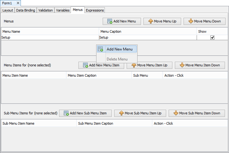
Menus
Each form may have a number of menus which appear on the toolbar of the client window. Each menu may have a number of menu items. Each menu item may invoke an action or it may be a sub menu, which in turn may have further sub menu items. Menus cannot be more than two levels deep.
Adding a new menu
To add a new menu:
Right-click on the Menus table and click Add New Menu.
Rename the Menu Caption to the text which will be displayed in the menu toolbar of the form.
Menus may be hidden if no longer required by un-ticking the Show property.
Adding menu items
Each menu contains a number of menu items. To add a menu item:
Select a menu from the Menus list. Any existing menu items for that menu will be shown in the Menu Items list.
Right-click on the Menu Items list and select Add New Menu Item.
Each menu item may invoke an action or open a sub menu.
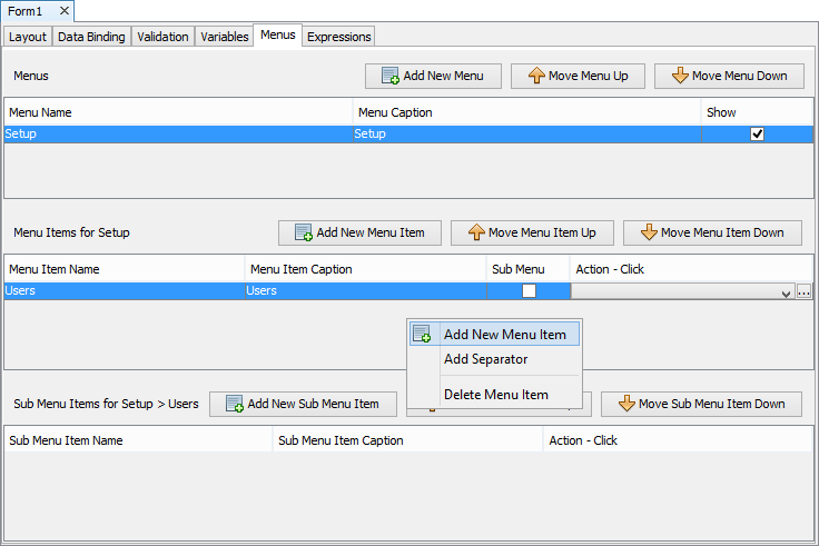
If the menu item is a sub menu, then sub menu items can be added in a similar way to adding menu items for a menu.
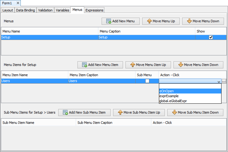
Assign actions to menu items
A menu item can either be a sub menus, call an expression or open a form. A sub menu item cannot be a sub menu but can call an expression or open a form.
To set a menu item as a sub menu:
Tick the Sub Menu property of the menu item.
Add sub menu items in the Sub Menu Items list.
To assign an expression to the menu item or sub menu item:
Select an expression from the expressions list drop down. Any form expression or global expression may be executed.
To assign a Open Form action to the menu item or sub menu item:
Click on the
 button to open the
Open Form panel show below.
button to open the
Open Form panel show below.
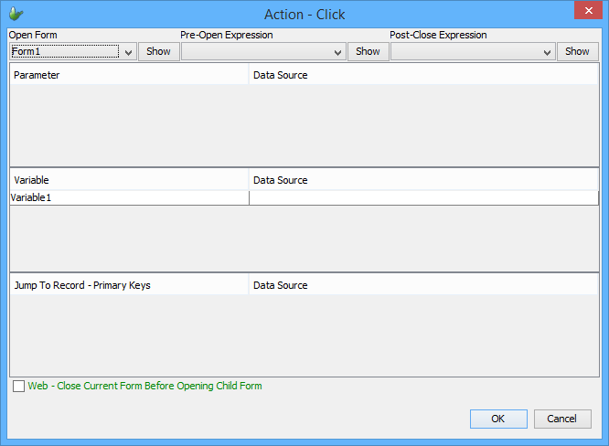
Select the form to open and fill in any other details in the Open Form panel.
Using global menus
Menus can be created on the Globals panel and used in any form in the application. By default when a global menu has been created, it will be displayed in each form's menu list with its Show property un-ticked. Global menus are shown in grey and prefixed with the "global" key word.
To include a global menu in a form, simply tick the Show
property of the global menu. The global menu will then be shown on
the form as if it were created on the form itself.
Enabling/disabling menu items
Individual menu items can be enabled or disabled using the Form object's EnableMenuItemByIndex and EnableMenuItemByPosition method. See Objects Definitions Reference Manual for more details and examples.
Expressions
Form expressions are a fundamental part of BrightBuilder operations. These are used to perform embedded business logic or field calculations within a form. Expressions can be used to handle events and actions in a form such as when the form is opened/closed or when a control is clicked or edited. An expression is a combination of identifiers, operators, values and methods. The user has access to the data sources within the scope of the form where the expression was created. Here are the few common examples of operations where to use expressions:
Establish a validation rule, or set a default field value.
Setting a condition or specifying arguments for carrying out an action or many actions.
Updating the database
Opening and closing a child form.
Setting the child form parameters and variables
Enabling and disabling sync rules
Setting the control properties.
Perform calculations and logic
Set form control values
More can be found about expressions in the Expressions chapter of this document.
Data Sources
To create expressions, the data sources available in the form are used extensively. BrightBuilder uses a Data Source tree to display the data sources that can be selected and dragged into the expressions or as parameters to Methods. It is populated with the data sources that are available from within the project at the current time. In other words, when the tree is to be displayed, BrightBuilder looks at the project, discovers all the data sources that currently exist and populates the tree with these data sources.
Data Sources are also used for query parameters, in data validation rules and in data binding.
The section on Data Source tree offers a complete discussion on data sources and the different types of data sources.