Form Controls
Contents Hide
All the information on a BrightBuilder form are contained in controls. Form controls are objects on a form that display data, perform actions or are used for decoration. Edit Controls can display data, a button can open another form, a group box can group controls and make them more readable, to name a few.
BrightBuilder includes the following types of controls, which are all accessible in the form layout toolbar: label, edit control, button, combo box, listview, radio button, check box, group box, date time picker, image and scribble.
Controls can be bound, unbound or calculated. A bound control is tied to a field in an underlying table through a query. Use bound controls to display, enter, and update values from fields in the database. An unbound control has a constant data source; unbound controls can be used to display information and pictures. An example of unbound controls may be static labels and images in a form. A calculated control uses an expression as its data source, for example, an edit field can take two numbers the user enters, use an expression to calculate the total and bind this expression to the display in the edit field.
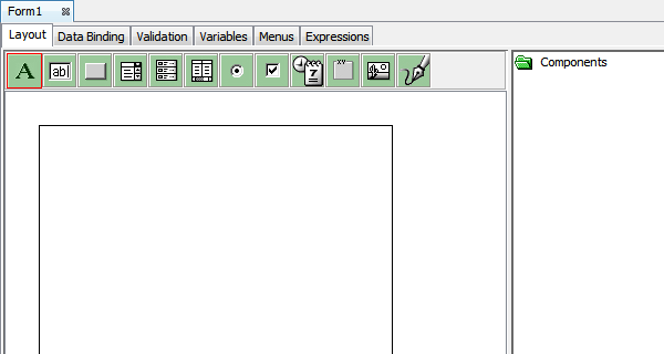
To include a form control on the form, simply select, drag and drop the form control onto the form layout, as illustrated below:
Form controls have methods to manipulate their behaviour. The user can set the focus, disable or enable, show or hide form controls. Listviews, combo boxes, and scribbles also have special methods that allow the user to manipulate the data linked to these controls. Control methods can be found by expanding each control's nodes in the Data Sources tree under Forms > Controls. Only the properties of a control that has placed on the form can be changed.
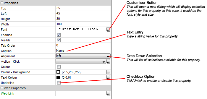
Each control also has property settings that can be changed to alter the way the control looks and behaves. The following image is a label property list, from this property list you can modify any of the label properties by selecting from the drop down list or by entering text. This also illustrates the different types of selection and entry options you have on the property list.
This section will describe in detail the available controls in BrightBuilder.
Label 
Labels are used in the form to display descriptive text such as titles, captions, or brief instructions. The label caption in an expression can also be edited. The following table describes the properties for labels.
| Property | Default |
| Action - Click | Executes the specified action when the label is clicked |
| Alignment | left |
| Caption | Label1 |
| Colour | False |
| Colour - Background | [255, 255, 255] |
| Colour - Text | [0,0,0] |
| Enabled | True |
| Font | Arial 12 Plain |
| Height | Current height |
| Left | Current x-coordinate |
| Tab Order | 0 |
| Top | Current y-coordinate |
| Underline | False |
| Visible | True |
| Width | Current width |
| Web Link |
Edit Control 
Edit controls are used in a form to display data or accept input from user. It can be bound or unbound. It can accept or store data to a record source, expression or data constant. A mask can be included that will further restrict user input by specifying input characters.
You can also use the Number properties to restrict user input. When using an edit control with the number properties turned on and the value of the edit control will be saved to the database, the value of the edit control will be validated based on the number properties such as the minimum and maximum number value allowed to enter.
The following list the properties of an edit control
| Property | Default |
| Action - Got Focus | |
| Action - Lost Focus | |
| Action - Text Change | |
| Alignment | left |
| Colour | False |
| Colour - Background | [255,255,255] |
| Colour - Text | [0,0,0] |
| Default Value | |
| Enabled | True |
| Font | Arial 12 Plain |
| Format | |
| Height | Current height |
| Hint Text | The text to be displayed when the edit control is empty (Android and iOS only) |
| Launch Software Keyboard | True |
| Left | Current x-coordinate |
| Mask | |
| Mask Include Mask | True |
| Mask Place Holder | _ |
| Max Length | 0 |
| Multi-line | False |
| Multi-Line Auto-Scroll | False |
| Number | False |
| Number - Max | 999999 |
| Number - Min | 0 |
| Number - Precision | 0 |
| Numeric Keypad | None |
| Password | False |
| Read Only | False |
| Scroll Bar Horizontal | False |
| Scroll Bar Vertical | False |
| Tab Order | 0 |
| Top | Current y-coordinate |
| Visible | True |
| Width | Current width |
| Web - File Input | false |
Button 
Buttons are used on a form to start an action or a set of actions. For example, a button can be created that opens another form or display a message. To make a button do something on a form, write an expression and attach it to the buttons Action-Click property.
Text can be displayed on a button in a form by setting the Caption property or an image can be used to display as a button. The button caption can also be changed or assigned a new value within an expression.
| Property | Default |
| Action - Click | |
| Action - Got Focus | |
| Action - Lost Focus | |
| Caption | button1 |
| Colour | False |
| Colour - Background | [255,255,255] |
| Colour - Text | [0,0,0] |
| Default Button | False |
| Enabled | True |
| Font | Arial 12 Plain |
| Height | Current height |
| Image | False |
| Image 1 Up | |
| Image 2 Down (Optional) | |
| Image 3 Focused (Optional) | |
| Image 4 Disabled (Optional) | |
| Image Include Text | False |
| Image Text Position - Left | 0 |
| Image Text Position - Top | 0 |
| Left | Current x-coordinate |
| Tab Order | 0 |
| Top | Current y-coordinate |
| Visible | True |
| Width | Current width |
Combo Box 
In a combo box, you can quickly and easily select a value from a list or type a value without using too much space on a form. BrightBuilder combo box acts as a text box and a list box combined or a drop down list box depending on the Style property.
It is possible to bind a query to a combo box to list the table columns attached to that query using the Query and Query Column property or simply use a fixed set of data contained in the Fixed List property. By using the AddString method under the Data Sources\Form\Controls\<combo box name> in an expression, values or items can be added to your combo selection at runtime.
Combo box properties
| Property | Default |
| Action - Got Focus | |
| Action - Lost Focus | |
| Action - Selection Change | |
| Action - Text Change | |
| Default Selection | -1 |
| Default Value | |
| Disable Data Load On Form Open | False |
| Disable Data Load When Disabled | False |
| Disable Data Load When Hidden | False |
| Drop Down Size | 5 |
| Enabled | True |
| Fixed List | |
| Font | Arial 12 Plain |
| Height | Current height |
| Launch Software Keyboard | True |
| Left | Current x-coordinate |
| List Reference | |
| Max Length | 0 |
| Number | False |
| Number - Max | 999999 |
| Number - Min | 0 |
| Number - Precision | 0 |
| Query | |
| Query Column | |
| Sorted | False |
| Style | Combo |
| Tab Order | 0 |
| Top | Current y-coordinate |
| Visible | True |
| Width | Current width |
Listview 
Listviews are used to display a list of records based on the query selected. They can be used for viewing a simple report format or for selecting a value from the list that can be used with another control. Listviews can have one or more columns, which can appear with or without headings, left or right aligned, with or without text format.
Listviews in BrightBuilder are always data bound to a query. The query can be set in the List Query property. The query is the data source for the information/records to be displayed.
If the list query is parameterised, you can assign values to the listview query parameter in an expression by adding the assignment statement listview_name.query_name.parameter_name=??? and refreshing the listview.
The listview query parameter name can be dragged and dropped from Data Sources>Form>Parameters and the refresh method is from Data Sources>Form>Controls>listview_name. Assigning values to these parameters and refreshing the form or form control will run the query again.
Upon execution, listview header widths are saved when the user changes it. When the project is reloaded, the listview header widths are the same as set by the user and not the initial header widths specified in BrightBuilder because the user selected widths are stored in the registry under LOCAL_MACHINE.
Listviews can also include a check-box column, this column should be a boolean, integer or double field and will be displayed on the listview as a checkbox. The checkbox will be displayed on the first column of the listview, and the checkbox column itself does not need to be displayed on the listview layout. Once the user ticks on this checkbox, the table column will also be updated.
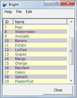
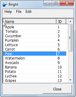
Another listview property is Sortable. When this property is true, upon execution, the users can click or tap on the listview header and the list will be sorted by that column in ascending order, clicking or tapping the header again will sort the list by the column in descending order.
The listview can only have one Action - * Click event. Thus, if there is an expression assigned to the Action-Double Click property of a listview, you cannot assign another expression or action to the Action-Single Click property.
The Read Only property allows you to disable or enable the listview checkbox attributes. This limits the user input on the listview checkboxes but still allows the action event properties to be executed.
Listview properties:
| Property | Default |
| Action - Double Click | |
| Action - Selection Change | |
| Action - Single Click | |
| Check-box Column | |
Colour - Alternate Rows |
False |
| Colour Coding | |
| Column Images | |
| Columns | |
| Data Grid - Auto Save | False |
| Disable Data Load On Form Open | False |
| Disable Data Load When Disabled | False |
| Disable Data Load When Hidden | False |
| Enable Rules | |
| Enabled | True |
| Font | Arial 12 Plain |
Headers - Drag to re-order |
False |
| Height | Current height |
| Keep Scroll Position | False |
| Left | Current x-coordinate |
| List Query | |
| Read Only | False |
| Searchable | False |
| Selection - Allow Multiple | False |
| Sortable | False |
| Tab Order | 0 |
| Top | Current y-coordinate |
| Visible | True |
| Width | Current width |
| Web - Blocking Enabled | False |
| Web - Block Size Display | -1 |
| Web - Wrap Content in Cell | False |
Multiple Selection
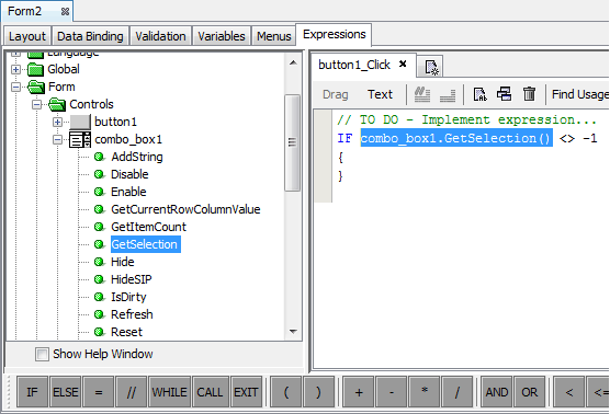
This attribute allows multiple selection of the listview rows at runtime. GetSelection(), GetSelectionCount() and SetSelection() methods of the listview control, the user's multiple selection can be processed.
The following is a code snipped showing how that could be done.
// Returns the first of the multiple selection
local.FirstSelection = listview1.GetSelection();
// Returns the number of rows selected
local.SelectRowCount = listview1.GetSelectedCount();
// Find all the selected items
local.Count = 0;
local.Index = local.FirstSelection;
WHILE(local.Count < local.SelectRowCount)
{
IF(listview1.IsRowSelected(local.Index))
{
local.Count = local.Count + 1;
// Make the row as the current selection
listview1.SetSelection(local.Index);
// Do something
// ...
}
local.Index = local.Index + 1;
}
Grid data
BrightBuilder allows you to also have grid data within your listviews, allowing users to edit and save changes completely within listviews.
The following controls are available as grid data:
edit control
drop down box
date-time picker
checkbox
button
Each of these controls have specific properties that is a subset of the properties of the equivalent form control, which can be modified to suit the application requirements. These may be modified within the 'Columns' editor for the listview, accessed via the control's properties.
The Data Grid -Auto Save property of the listview allows the automatic saving of each grid data when the control has lost focus. Otherwise, the listview's Save() method may be called to commit all changed values to the database.
Please note, this feature cannot be used with a listview's 'Searchable' functionality turned on.
Web Action
Specifying an expression under the listview 'web action' column property will allow the data cell contents to become clickable/tapable as a web link. When the listview's row is clicked, it will become selected, then run the expression (selected with the drop down) or form open action (selected with the ellipsis) specified as the column property.
This web-only feature offers an intuitive alternative to row selection, and is designed to offer greater compatibility across devices operating via the BrightServer Mobile Gateway.


Colour Coding and Column Images
To give field users a more pleasing view of the list data, Bright Software has included a colour coding and column image properties to the listview. This allows each row data to be displayed with different colour background and colour text depending on the value of the column fields. While the column image displays an image on the left most column of the row to show importance or status of the row depending on the image depicted.
Alternate Row Colouring
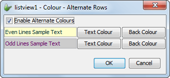
Row colouring independent of row data values may be implemented using the 'Alternate Row Colouring' property of the listview control. Here, the setting may be enabled, with the text/background combinations for even and odd rows able to be set. This will take place in the row prior to any other colour settings taking place. The dialog also contains lines of sample text to preview the colours chosen, as shown below. By default, this property is set to False.
Drag and Drop Headers
Setting the ''Headers - Drag to Reorder' setting to true will allow users to click on any column header in the list view and re-order it left and right in the form by dragging. Valid positions are marked by a darkened separator between column headings. Releasing the column heading in a valid position will result in the reordering of the listviews columns. This change, like column widths, are saved in the registry and persisted until reedited.

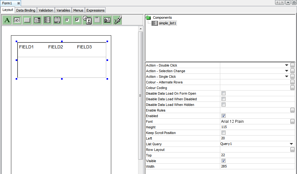
Simple List 
A simple list is fundamentally a listview control with a single column of which layout can be defined by the designer. The behaviour and functionality of the properties listed in the below table are explained in the Listview control section above.
 The
simple list control is not available on all platforms. Currently
it is supported on Android and iOS platforms. If it is not available,
then BrightForms will display the standard listview control instead.
The
simple list control is not available on all platforms. Currently
it is supported on Android and iOS platforms. If it is not available,
then BrightForms will display the standard listview control instead.
| Property | Default |
| Action - Double Click | |
| Action - Selection Change | |
| Action - Single Click | |
Colour - Alternate Rows |
By default, this feature is off. When defined, it will override the text colours selected for the labels in the row layout. |
| Colour Coding | When a row colour coding is active, the colours defined by the rule will override the text colours defined by the labels in the row layout. |
| Disable Data Load On Form Open | False |
| Disable Data Load When Disabled | False |
| Disable Data Load When Hidden | False |
| Enable Rules | |
| Enabled | True |
| Font | Arial 12 Plain |
| Height | Current height |
| Keep Scroll Position | False |
| Left | Current x-coordinate |
| List Query | |
| Row Layout | Displays a visual designer to layout the list row. |
| Read Only | False |
| Sortable | False |
| Top | Current y-coordinate |
| Visible | True |
| Width | Current width |
When it is dragged onto the form, similar to the listview control, it will not have a query. The designer needs to specify the query to be used by the list. Until a query has been selected, the row layout designer will not be available to change the row layout. BrightBuilder will display the 'Select a List Query first' message in the property's value cell.
Upon selection of a query, the Row Layout property will be available for the user to click on. When this property is clicked, BrightBuilder will display the row layout designer. Similarly the user can also double click the control to open the row layout designer.
Upon
selection of the list query, BrightBuilder will create a default
row layout by simply creating label controls for each query output
field and laying them in a vertical fashion side by side. This
will look similar to a standard listview control appearance. If
the query output is a binary blob, then an image control will
be added to the layout for the field in question.
Double clicking on the simple list control or the Row Layout property, the row layout designer dialog will be shown.
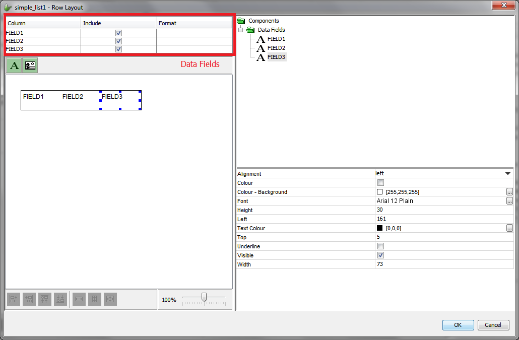
The Row Layout designer functionality is similar to that of the standard form designer. However the capabilities of the row layout designer is slightly different and somewhat limited when compared to the form designer.
It provides a Data Fields section as highlighted by the red rectangle section in the image above. This section lists the query output fields. Each of the query output field is visualised by a label control if it is not a binary blob field. If the query output field is a binary blob field (e.g. a field containing images), then an image control is used to display the image content.
By ticking on or off the Include check box element for each data field, a query output field can be included or excluded in the row layout. As each data field is included or excluded from the layout, they will appear or disappear from the row layout.
The toolbar at the top allows the addition of new non-data bound labels and image controls for providing additional visualization to aid the application users.
The row height and width can be changed by the simply using the mouse and changing the row dimensions through its border.
Upon saving changes by clicking on the OK button, the simple list control will show the auto-scaled version of the row designer layout by using the physical width of the control and the actual height of the row set by the row layout designer. At runtime, BrightForms clients uses the same algorithm to auto-scale the row content on the device.
The
row layout designer allows defining text colours for the label
controls. However these text colours defined at the design time
may be overridden by the text colours defined by the colour coding
rules or the row alternate colouring if it is enabled.
Radio Buttons 
Radio buttons can be used to accept or display a Yes/No value from an underlying record source. It is also used to select from a short list of options and returns only one value.
Radio buttons are grouped so that only one may be selected/depressed at a time.
When a group of radio buttons are on a form, the Default Selection property of one of the radio buttons must be selected to True to initialise the group, otherwise BrightBuilder will issue a validation error. The number in its Value property distinguishes radio buttons, thus each radio button in a group must have a unique Value.
| Properties | Default Values |
| Action - Click | |
| Action - Got Focus | |
| Action - Lost Focus | |
| Caption | radio_button1 |
| Colour | False |
| Colour - Background | [255,255,255] |
| Colour - Text | [0,0,0] |
| Default Selection | False |
| Enabled | True |
| Font | Arial 12 Plain |
| Group | 0 |
| Height | Current height |
| Left | Current x-coordinate |
| Tab Order | 0 |
| Top | Current y-coordinate |
| Value | 0 |
| Visible | True |
| Width | Current width |
You can programmatically set the value and state of the radio buttons. Remember that radio buttons must be in groups and each radio button in the group will have its own value. In this way, the collection of radio buttons, contains the value. For example, radio_button1 and radio_button2 are in the same group, and has the values 0 and 1 respectively. Then in your expression, by assigning a value to a radio button in the group, you can set the selection. It does not matter which radio button is actually assigned to, because the assignment statement is assigning a value to the group, not the individual radio buttons.
// Select radio_button1
radio_button1 = 0
// Select radio_button2
radio_button1 = 1
Note For the radio buttons to work, they must always be treated
as a group. On design, make sure Visible and Enabled properties
have the same values. Also, use the Tab Order property to make
sure controls have priority and the grouping of the radio buttons
are not displaced.
Check Boxes 
BrightBuilder check boxes allow the user to accept or decline an option or a set of alternative options. Several check boxes can be selected at a time, depending on the application. It is recommended to use check boxes together with a group box to ensure that the end-user will determine that the check boxes are grouped.
A check box can return a True or False value depending on whether it was checked or not in the form interface.
The following list the check box properties:
| Properties | Default Value |
| Action - Click | |
| Action - Got Focus | |
| Action - Lost Focus | |
| Caption | check_box1 |
| Colour | False |
| Colour - Background | [255,255,255] |
| Colour - Text | [0,0,0] |
| Default Value | False |
| Enabled | True |
| Font | Arial 12 Plain |
| Height | Current height |
| Left | Current x-coordinate |
| Tab Order | 0 |
| Top | Current y-coordinate |
| Visible | True |
| Width | Current width |
DateTime Picker

The DateTime Picker control enables selection of a date and/or time. The date/time Style and the control interface are customisable with the Style and Up-Down Button properties respectively.
The default value of a dateTime picker is always the current date. To change the default date displayed, simply subtract or add the number of seconds in an expression before opening the form interface. Always remember that dateTime values are represented in seconds.
Read Appendix C: Date-Time Formatting and Operations for more information and examples on datetime formatting and operations.
| Properties | Default Value |
| Action - DateTime Change | |
| Action - Got Focus | |
| Action - Lost Focus | |
| Enabled | True |
| Font | Arial 12 Plain |
| Height | Current height |
| Left | Current x-coordinate |
| Style | Short Date |
| Style Custom Format | |
| Tab Order | 0 |
| Top | Current y-coordinate |
| Up-Down Button | False |
| Visible | True |
| Width | Current width |
| Web Year Range Enabled | False |
Web Year Range Start |
1982 |
Web Year Range End |
2042 |
 Note that when you use short date or long date style on the DataTime
picker, the Regional Settings to your device or computer will
be observed. Or you can use a Custom style for your datetime display.
Note that when you use short date or long date style on the DataTime
picker, the Regional Settings to your device or computer will
be observed. Or you can use a Custom style for your datetime display.
Group Box 
Group boxes are used to visually group a set of controls in the form. The caption can be changed to some descriptive text for the group.
| Properties | Default Value |
| Caption | group_box1 |
| Colour | False |
| Colour - Background | [255,255,255] |
| Colour - Text | [0,0,0] |
| Enabled | True |
| Font | Arial 12 Plain |
| Height | Current height |
| Left | Current x-coordinate |
| Tab Order | 0 |
| Top | Current y-coordinate |
| Visible | True |
| Width | Current width |
Image 
The image control displays BMP and JPG images to the form. Upon importing an image file, BrightBuilder stores this image to the local temporary files and to the project application definition.
It is necessary to take note of the image filenames that are used to load in the image controls in all your BrightBuilder applications. It is recommended that unique filenames are used for all image files that will be used in all BrightBuilder projects.
The scroll bars will only be shown if the image file displayed is bigger than the image control size. Any controls which overlap with image controls will display on top when the application executes.
The following list the image control properties:
| Properties | Default Value |
| Action - Click | Executes the specified action when the image is clicked (Android and iOS only) |
| Cache Image | False |
| Font | Arial 12 Plain |
| Has Border | True |
| Has Scroll Bars | False |
| Height | Current height |
| Image - Filename | |
| Left | Current x-coordinate |
| Style | None - The image will be displayed as is. |
| Tab Order | 0 |
| Top | Current y-coordinate |
| Visible | True |
| Width | Current width |
If the 'Cache Image' property is set to true, a base64binary image from an image control can be used in an expression to assign the value to a variable or any other operand in an Form Expression as shown in the example below:
// Save image binary value into variable
variableBinaryImage = image1
If the 'Cache Image' property is set to false, the image will only return a NULL value.
Scribble 
The Scribble control enables the user to capture, modify and view scribble images in the form layout. This is most advantageous when the signature of a customer need to be captured to prove the delivery of an order. With 'Snap to Grid' options, it may also be used to construct line vectors within the drawing space.
Through methods, it can also load an image which the user can mark up, and also save to file. Furthermore, with the EnableUndoRedo method, it may record the steps performed within the scribble, and rollback/forward also via scribble methods.
In BrightForms, scribble data is saved with compression, and data may be assigned to the control either compressed or decompressed from any project data source. However, due to this compression, a scribble's captured data must be decompressed before use outside the application. This may be achieved with the Zip.UnzipBinary() method when writing to file. Similarly, when synchronising compressed data to a Database's binary field, the 'Needs to Decompress' option must be checked via the BEP's Query Mappings definition. Scribbles are able to read data that are both decompressed and compressed, however.
BrightBuilder Scribble control can be customised to have borders or not, or to indicate the pen width. The full range of scribble properties available through BrightBuilder are as follows:
| Properties | Default Value |
| Colour - Background | [255,255,255] |
| Colour - Pen | [0,0,0] |
| Enabled | True |
| Font | Arial 12 Plain |
| Has Border | True |
| Has Scroll Bars | False |
| Height | Current height |
| Left | Current x-coordinate |
| Pen Width | 2 |
| Read Only | False |
| Save Image As | Original |
| Tab Order | 0 |
| Top | Current y-coordinate |
| Visible | True |
| Width | Current width |
Snap to Grid |
False |
Snap to Grid - Grid Size |
20 |
Refer to Form Control Properties in the Appendix for complete details of component properties. .