Form Control Properties - Scribble
Contents Hide
Font
Use the Font property to specify the font, style and size of the form controls.
The default font for BrightBuilder is Arial 12 Plain. Set the default font for all your controls in your project with the Default Font project property.
For more information on Font property, read Changing Fonts in the How To document.
Enabled
Form controls can be enabled or disabled on initial execution with the Enabled property. With this property it is possible to disable for example, a button until data has been changed in an edit control, then use a control action property to call an expression to enable the button.
Set the Enabled property by selecting True from the drop down list.
Visible
You can use the Visible property to show or hide a control on a form. Set this property to True if you want the form control to be visible upon execution. Select False to hide the control and use an expression in a form or form action to make the control visible after a certain criteria or user input.
Tab Order
The Tab Order property accepts an integer to specify a control’s place in the tab order of a form. The first control in the tab order must have a Tab Order of 1 to initiate the tab orders.
Tab order - order in which the TAB key iterates through components.
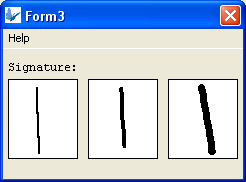
Pen Width
The Pen Width property allows you to specify the width of the pen for a scribble control. It accepts an integer value and the default value is 2.
The following images are scribble control samples with different pen width; 2, 4, and 7 respectively.
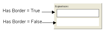
Has Border
The Has Border property applies a thin black border around the scribble and bitmap control. The default value for this property is True. Simply select False from the drop down list if to have no border around the scribble control.
The following image is two samples of a scribble control and will shows the difference when the Has Border property is set to True or False.
Has Scroll Bars
The Has Scroll Bars property of the bitmap and scribble controls allows the application users to scroll through a big bitmap or picture. Unless the bitmap displayed is bigger than the control size the scroll bars will not be shown.
Colour – Pen
This property allows specification of the pen colour of the scribble control.
To set the colour of the scribble pen, click on the customiser button to display the colour editor dialog shown below:
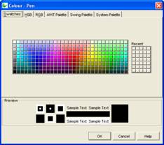
Select the colour and click OK to enable and display the new pen colour upon execution.
Colour - Background
Colour - Background property allows specification of a background colour for the label, edit and scribble controls.
Select the background colour by clicking on the customizer button to display the Colour - Background property editor like the one below:

Select the desired colour from the property editor window, it is also possible to change the HSB, RGB, AWT Swing and System Palette. Then click OK to continue.
Scribble background colour will automatically be enabled once the Colour – Background property has been set.
Enable the background colour for the edit and label by selecting True in the Colour property.
Read Only
The Read Only property causes the field to be read only, meant to display data. Users will not be able to enter data on it. In the case of the listview control, the checkboxes will be read only, but the action events will still be executed.
Save Image As
Determines how the scribble data will be passed around in BrightForms, which can be set as Bitmap or JPEG encoding. The default value for this option is ‘Original’ which will retain the original Bitmap or JPEG encoding of the image loaded into the scribble.
Note that this data is optimised for BrightForms internally. If it needs to be accessed by external applications, decompression measures must be taken, such as specifying the column to be decompressed via mapping in a BrightServer. If the scribble needs to be saved to a file, there are specific Scribble methods to create externally readable files.
Snap To Grid
The Snap To Grid property will have the scribble control operate in 'line mode'. In this mode, tapping and holding in the control will specify the start point of a given line, and the end point for preview. Releasing the hold gesture will commit the line to the control.
When in this mode, co-ordinates for the start and the end points may be specified by the Snap To Grid - Grid Size property, which will align points to the nearest grid point.
Snap To Grid - Grid Size
The value specified for Snap To Grid - Grid Size determines a grid for a scribble control which lines' start and end points must exist on. If points are defined outside of this grid, the points' co-ordinates will be rounded up or down to the nearest grid coordinate.
Line mode, specified by the Snap To Grid property, must be activated for this grid to be in effect.