Form Control Properties Appendix
Contents Hide
- Action – Click
- Action – DateTime Change
- Action – Double Click and Action – Single Click
- Action – Got Focus and Action –Lost Focus
- Action – Selection Change
- Action – Text Change
- Alignment
- Cache Image
- Caption
- Check-box Column
- Colour
- Colour - Background
- Colour – Pen
- Colour - Text
- Colour Coding
- Column Images
- Columns
- Data Grid - Auto Save
- Default Button
- Default Selection
- Default Value
- Disable Data Load On Form Open
- Disable Data Load When Disabled
- Disable Data Load When Hidden
- Drop Down Size
- Enable Rules
- Enabled
- Fixed List
- Font
- Format
- Group
- Has Border
- Has Scroll Bars
- Hide Headers
- Image
- Image 1 – Up
- Image 2 – Down (optional)
- Image 3 – Focused (optional)
- Image 4 – Disabled (optional)
- Image Include Text
- Image Text Position - Left
- Image Text Position - Top
- Image - Filename
- Keep Scroll Position
- Launch Software Keyboard
- List Query
- List Reference
- Mask
- Mask – Include Mask
- Mask – Place Holder
- Max Length
- Multi-line
- Multi-Line Auto-Scroll
- Number
- Number - Max
- Number - Min
- Number - Precision
- Numeric Keypad
- Password
- Pen Width
- Query and Query Column
- Read Only
- Save Image As
- Scroll Bar - Horizontal
- Scroll Bar - Vertical
- Searchable
- Selection - Allow Multiple
- Snap To Grid
- Snap To Grid - Grid Size
- Sortable
- Sorted
- Style
- Style – Custom Format
- Tab Order
- Up-Down Button
- Underline
- Value
- Visible
- Web - Blocking Enabled
- Web - Block Size Display
- Web - Wrap Content in Cell
- Web - File Input
- Web Link
This section discusses in detail all the form control properties and the means to set and modify these properties. The form control properties are listed in alphabetical order.
Action – Click
Use the Action – Click property of the button, radio button and check box controls to execute an expression or open a form when the control has been clicked. A click even can occur when the user presses the left-mouse button or the ENTER key when the control is on focus.
Action – DateTime Change
The Action-DateTime Change property is used to execute an expression or open a form when the DateTime picker component has been changed.
Action – Double Click and Action – Single Click
Use the Action – Double Click or the Action – Single Click properties of the listview control to run an expression or open a form when the user presses and releases the left mouse button twice over the listview within the double-click time limit of the system (for a double click) or when the user presses and releases the mouse button once (for single click).
This property commonly used when wanting to open the record (on another form) of the row selection.
This expression, however, will not be enabled if the row selected meets any conditions defined in 'Enable Rules' property.
Action – Got Focus and Action –Lost Focus
The Action – Got Focus property runs an expression or opens a form when a control receives the focus from the user through the mouse or keyboard. While Action – Lost Focus will run an expression or open a form when it loses the focus.
For example, by attaching a Got Focus expression to a control on a form, you can guide the user through your application by displaying brief instructions or messages in a text box. You can also provide visual cues by enabling, disabling, or displaying controls that depend on the control with the focus or without the focus.
A control can receive the focus only if its Visible and Enabled property is set to True.
These properties applies to the combo box, radio button, check box, dateTime picker, button and edit controls.
Action – Selection Change
Use the Action-Selection Change property to run an expression or open a form when the user changes the selection from the combo list. The listview also has an Action-Selection Change property to run an expression or open a form when the Up/Down keys on the keyboard are pressed.
This expression, however, will not be enabled if the row selected meets any conditions defined in 'Enable Rules' property.
Action – Text Change
The Action-Text Change property will execute an expression or open a form when there is a text change in the combo box or edit control.
Alignment
Select the type of text alignment in a label and edit control.
Open the form in the Source Editor window
Select the control in the form Layout tab; the Component panel will display the control properties.
In the Alignment property box, click Left, Centre or Right. Changes will automatically be reflected in the form layout.
Cache Image
If the Cache Image property is set to true, a base64binary image from an image control can be used in an expression to assign an image value to a variable or any other operand in a Form Expression. This is to optimise memory management on mobile devices, but defaults as true regardless when loading on desktop. It is necessary to save images in forms to the database.
Caption
The Caption property is used to provide helpful information to the user through captions on objects in various views:
Form captions are the text that appears in the title bar of the executable form.
Label, Button, Radio box, Check box and Group box captions specify the text that appears in the control.
The Caption property is a string input. For controls, set this property in the Properties view in the Component panel. Form captions can be set in the Properties view of the Explorer window.
If the caption to a control or form is not specified, BrightBuilder will assign the default name of the object as its caption.
Check-box Column
The Check-box Column property of the list view allows a column to be displayed as a checkbox. The field that is specified as a check-box column should be a boolean, integer or double data type. When the checkbox is ticked the state of the checkbox is stored immediately into the database table column.
Colour
This property enables the background and text colour of the edit and label controls.
Set the Colour – Background and/or Colour – Text properties to the colour required then simply set the Colour property to true to enable and display the colours specified.
Set the Colour property by selecting True from the drop down list.
Colour - Background
Colour - Background property allows specification of a background colour for the label, edit and scribble controls.
Select the background colour by clicking on the customizer button to display the Colour - Background property editor like the one below:

Select the desired colour from the property editor window, it is also possible to change the HSB, RGB, AWT Swing and System Palette. Then click OK to continue.
Scribble background colour will automatically be enabled once the Colour – Background property has been set.
Enable the background colour for the edit and label by selecting True in the Colour property.
Colour – Pen
This property allows specification of the pen colour of the scribble control.
To set the colour of the scribble pen, click on the customiser button to display the colour editor dialog shown below:
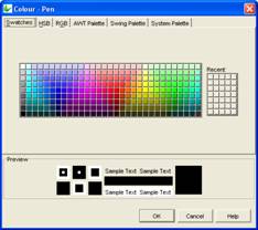
Select the colour and click OK to enable and display the new pen colour upon execution.
Colour - Text
Use the Colour - Text property to change the text colour for the label and edit control.
To change the text colour, click on the customise button to display the following dialog:

Select the desired colour and click OK.
Make sure to enable the text colour by selecting True in the Colour property. .
Colour Coding
Listviews may have their rows individually colour coded, depending on the column values of the data contained in each row. The Colour Coding property of a listview allows users to change how this colour coding is executed. Editing this property will result in the following window:
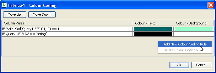
As shown, adding new Colour Coding Rules and deleting unnecessary ones is handled by the Right-Clicked context menu.
Several colour rules may be assigned to a particular list view, however each row may only have one colour assigned to it. When defining the colour coding of a listview, be aware that the Column Rules are executed in order, and the first match to a column rule will result in that colour change to the row in question. To change this order, use the 'Move Up/Down' buttons.
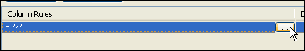
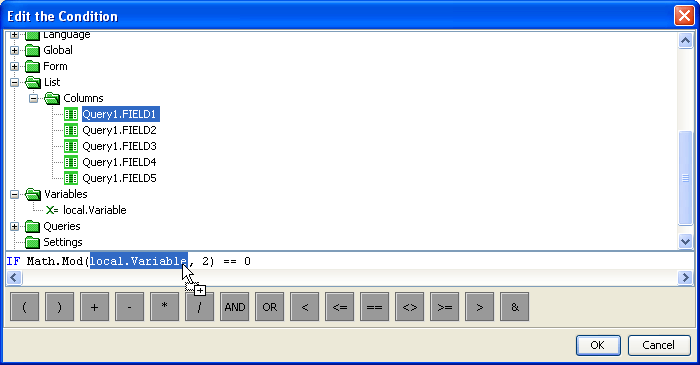
Editing a rule via its ellipsis will bring up the 'Edit the Condition dialog'. Here, operands may be dragged and dropped from the data source tree into the condition. Unlike a typical DST, the DST used in listiviews' condition editing includes a 'List > Columns' folder, which is to used to look up field values based on each row of the listview.
Once the conditions are set, the Colour Background and Colour text of the row is set in a similar fashion to labels or edit controls.
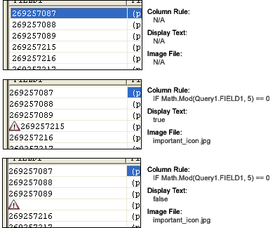
Column Images
This property displays an image on the left most column of a listview's rows to show importance or status of the row depending on the image depicted. Editing this property of the listview is handled by the following Column Images dialog:
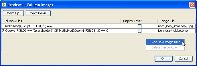
As shown, adding new Column Rules and deleting unnecessary ones for the Column Images is handled by the Right-Clicked context menu.
Several images may be assigned to a particular list view, however each row may only have one image assigned to it. Therefore the Column Rules are executed in order, and the first match to a column rule will result in that image displayed for the row in question . To change this order, use the 'Move Up/Down' buttons.
Clicking on the ellipsis of a newly added Image Rule will open up that rule for editing.
Editing a rule will bring up the 'Edit the Condition dialog'. Here, operands may be dragged and dropped from the data source tree into the condition. Unlike a typical DST, the DST used in listivews' condition editing includes a 'List' folder, which us to used to look up field values based on each row of the listview.
Once set, exactly what image and how it should be displayed can be changed using the 'Display Text' and 'Image File' columns Below are diagrams about how the settings are processed and rendered BrightForms.
Columns
The Columns property of Listviews allows alters the way the columns of the query list are to be displayed i.e. column heading, alignment, width or format. There are settings to also include or exclude columns from the List Query.
To modify the Columns property of the List Query:
Select the Listview control from the form Layout tab.
Make sure there is a List Query attached.
In the Columns property box, click on the customizer to display the Property Editor window.
In the Property Editor: Columns window, select the column to modify and do any of the following:
Include/exclude column by ticking or un-ticking the Include checkbox
Change the column header using the Name field. The text typed will be displayed inthe listview header. By default it contains the database table column name.
Select column text alignment. Default is left alignment.
Adjust the column Width display. This is the width of the column in relation to the listviews width. This field contains how many percent of the list view width will be allocated for the column in question.
Change column Format display. This field specifies the format of the column. A date-time or a number value can be formatted by specifying a format string in this field. See Appendix C for date-time and Appendix D number formatting options.
Specify any data grid cells and/or their requirements.
Specify an expression is to be used as a web action.
Click OK to save changes.
The Column field in the Property Editor are the output fields of the query and cannot be modified.
Name field is a string input, if this field is not set, BrightBuilder will use the query output field name. This field can be left blank, i.e. no header.
Width field is a numeric value and will not accept any alpha-characters. When user inputs a character, cell border will become red and will not save user input.
Data Grid - Auto Save
With the 'Columns' property of the Listview, the 'Data Cell' columns may be defined such that each field under the column maybe edited, thus providing individual editable controls within each listview RowColumns. Each of these controls have specific properties to the equivalent form control, which can be modified to suit the application requirements.
If these type of columns are enabled, The Data Grid -Auto Save property of the listview allows the automatic saving of each grid data when the control has lost focus. It's default value is 'false' or disabled.
Default Button
Set to true to make this button default for the form. If focused and user presses the ENTER key, the action-click of the button will be executed.
Default Selection
The Default Selection property of the radio box triggers the initial value for the group of radio boxes in the form upon execution. Select TRUE or FALSE to set this property. Once a radio box is set as the default selection, it will be marked upon execution. Only one radio box can be the default selection for a group.
The Default Selection property of the combo box specifies the initial selection for the combo box. This has an integer value and is defaulted to 0 - the first value on the combo list. To make no selection, enter -1 for this property.
Default Value
Use the Default Value property of an edit control or combo box to specify a value that will be automatically displayed and entered in the edit/combo box control object or in the table columns if the control is data bound. For example, if most of your suppliers are in NSW, you could set the STATE field of the SUPPLIERS table to have a default value of “NSW”. You can accept the default value or type a new value over it.
Set the Default Value property by simply typing the value in text field provided
Whereas the Default Value property for the check box controls specifies if the control will initially be true or false.
Disable Data Load On Form Open
Set true to not run the query of the control when it first loads on the form. As such, the control’s values will only populate when the Refresh() method is called in an expression. This is best used to disable unnecessary loading on large queries for listviews and combo boxes.
Disable Data Load When Disabled
Data will not be loaded by the Refresh() method or otherwise if this value it set to true and this control is disabled.
Disable Data Load When Hidden
Data will not be loaded by the Refresh() method or otherwise if this value it set to true and this control is hidden.
Drop Down Size
The Drop Down Size property of the combo box sets the maximum number of rows to display in the combo box.
The Drop Down Size holds an integer value with 5 as its default setting. Set this property by using the combo box’s property list in the Component panel window.
If the actual number of rows exceeds the number specified by the Drop Down Size property setting, a vertical scroll bar appears in the combo box.
Enable Rules
Enable rules are a list of column rules. Typically, single and double click operations are available for all rows in a listview. Ie. they all will have their 'Action - Single/Double click' events or expressions enabled. However, if a listview has any enable rules, all rows will have these operations disabled except any rows which satisfy the conditions of these rules.
Adding or deleting column rules listed under the Enable Rules dialog is handled by the right-click context menu. Rules may then be edited via the use of the ellipsis Also in this dialog, precedence may also be changed using the 'Move Up/Down' buttons.
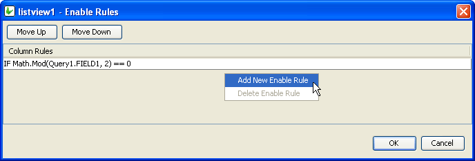
Editing a rule will bring up the 'Edit the Condition dialog'. Here, operands may be dragged and dropped from the data source tree into the condition. Unlike a typical DST, the DST used in listivews' condition editing includes a 'List' folder, which us to used to look up field values based on each row of the listview.
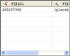
Therefore, if the above "IF Math.Mod(Query1.FIELD1, 2) == 0" statement was defined in the Enable Rules dialog, only even number will be able to
Enabled
Form controls can be enabled or disabled on initial execution with the Enabled property. With this property it is possible to disable for example, a button until data has been changed in an edit control, then use a control action property to call an expression to enable the button.
Set the Enabled property by selecting True from the drop down list.
Fixed List
The Fixed List property can specify a fixed list of values for a combo box control. When a fixed list is used, the values displayed in the combo box are not bound to a table column. For example, you know that there are only eight states/territories in Australia; you can create a fixed list for the State combo box that will be saved in the STATE table column.
To enter a fixed list, click on the customise button to invoke the Property Editor – Fixed List dialog below.
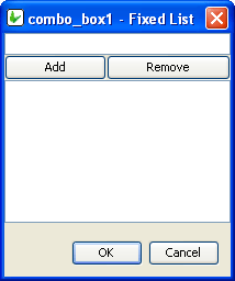
Enter a value or text in the field and click Add, the text entered will be included in the fixed list table. Add all the text required in the list and click OK to return to BrightBuilder development window.
To remove a text from the list, simply select the text from the fixed list table and click Remove in the Property Editor – Fixed List dialog.
Font
Use the Font property to specify the font, style and size of the form controls.
The default font for BrightBuilder is Arial 12 Plain. Set the default font for all your controls in your project with the Default Font project property.
For more information on Font property, read Changing Fonts in the How To document.
Format
This field specifies the format of the edit control. A date-time or a number value can be formatted by specifying a format string in this field. See Appendix C for date-time and Appendix D number formatting options.
Group
The Group property accepts a number to identify the radio button with a group of radio buttons. All radio buttons that is in a group must have the same Group property value.
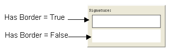
Has Border
The Has Border property applies a thin black border around the scribble and bitmap control. The default value for this property is True. Simply select False from the drop down list if to have no border around the scribble control.
The following image is two samples of a scribble control and will shows the difference when the Has Border property is set to True or False.
Has Scroll Bars
The Has Scroll Bars property of the bitmap and scribble controls allows the application users to scroll through a big bitmap or picture. Unless the bitmap displayed is bigger than the control size the scroll bars will not be shown.
Image
Set the Image property of the button to True to indicate that the control is an image button. This will display the image file imported in the Image 1 – Up property. The default value is False.
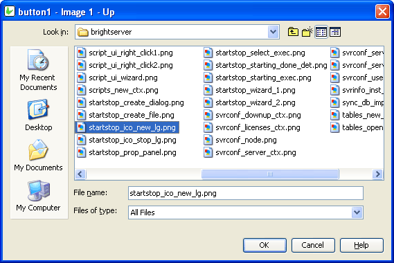
Image 1 – Up
Use the Image 1 – Up property to select and import the image file to be used for the button in the UP position.
Image 2 – Down (optional)
Use the Image 2 – Down property to select and import the image file to be used for the button in the DOWN position. This is an optional property to change the image button when the button is clicked.
Image 3 – Focused (optional)
The Image 3 – Focused property is an optional property to select and import the image file for the button when it is in focus.
Image 4 – Disabled (optional)
The Image 4 – Disabled property is an optional property to select and import the image file for the button when it is disabled.
Image Include Text
Set true to render the button’s caption value over the button’s assigned image. Has no effect if an image is not assigned to the button’s up position.
Image Text Position - Left
The X co-ordinate of the text overlay. Image Include Text must be enabled correctly for this value to take effect. The top-left corner of the button is point (0,0) in this co-ordinate system.
Image Text Position - Top
The Y co-ordinate of the text overlay. Image Include Text must be enabled correctly for this value to take effect. The top-left corner of the button is point (0,0) in this co-ordinate system.
Image - Filename
Use the Image – Filename property to select and import an image file to the bitmap control on the form layout.
Click on the customiser button to display the "bitmap1 - Image - Filename" dialog box shown below to select the BMP or JPG file to import and click OK.
Images are saved in the project bsp file together with the application definitions.
Keep Scroll Position
This property gives you the option to keep current scroll position after refresh.
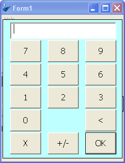
Launch Software Keyboard
The Launch Software Keyboard property displays the software keyboard upon project execution on the Pocket PC when an edit or combo box control gets the focus. This allows for user input convenience without having to click on the software keyboard located at the bottom of the screen. The default value is True.
List Query
Use the List Query property of Listview to identify the query to be used for the list.
Click the listview control in the form Layout tab to display the properties.
In the List Query property box, select the query from the query drop down list.
Once selected, you can change the Columns property of the List Query.
BrightBuilder automatically list all the queries available in the project in the List Query drop down list. When a new query is created, this is made known to all elements that can be attached to a query i.e. listviews and combo boxes.
Mask
A Mask acts as a filter that can selectively include or exclude certain characters or values. For example, when defining a database field, it is possible to assign a mask that indicates what sort of value the field should hold. Values that do not conform to the mask cannot be entered.
The Mask property in Bright Applications is a character based masked edit control; you can set the mask for each character. For example, you may have a 6-digit part number, where the first digit can only be a vowel, the second digit can only be the letters B, C or D and the remaining digits can be 0 through 9 inclusive.
The mask is constructed so that each character is inside the brackets, and all static characters (characters not entered by the user) are outside the brackets. Dashes can be used inside the brackets to indicate a range of characters.
The mask for the 6-digit part number, where the first digit can only be a vowel, the second digit can only be the letters B, C or D and the remaining digits can be 0 through 9 inclusive would look like this,
[AEIOUaeiou][BCD][0-9][0-9][0-9][0-9]
You can also append static characters in the mask, for example:
PART# [AEIOUaeiou]-[BCD][0-9][0-9][0-9][0-9]
Upon execution, the edit control will look like this:
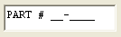
Mask – Include Mask
The Mask – Include Mask property of the edit control is a flag that allows you to include or exclude the mask characters as part of the input. Default value is True. For example, suppose the mask PART# [AEIOUaeiou]-[BCD][0-9][0-9][0-9][0-9] is given the valid input “PART# A-B0000”. If Include Mask is true, then the actual value passed will be “PART# A-B0000”, otherwise it would be
“AB0000”, with the mask characters stripped.
Mask – Place Holder
In this edit control property, you can select the character to appear where input is required. The default character is an underscore ( _ ). A space is equivalent to an underscore.
Max Length
The Max Length property of an edit control and combo box accepts an integer to limit the number of characters entered by the user.
The default value is zero which indicates that the control has unlimited character length (limited to the number of characters that the operating system can handle).
You use this property in conjunction with the string length of your table column fields.
Multi-line
You can use the Multi-line property of edit control to allow multiple lines to be displayed or entered. When this property is set to True, BrightForms can identify the (new line) character.
Multi-Line Auto-Scroll
Set this property to true to ensure that when the content of the edit control is refreshed, the component will be scrolled down to ensure that the last line is visible.
Number
Set the Number property of edit control or combobox to True to specify that the field can only accept integer or double values.
Number - Max
Set the maximum numerical value the control can contain. This is validated on a database save.
Number - Min
Set the minimum numerical value the control can contain. This is validated on a database save.
Numeric Keypad
Launches a numeric keypad, either small or large, on device. Default setting is 'None'.
Password
Set the Password property to True if you want the edit control to be a password text field. When the user enters a text, the characters are displayed as a series of asterisk (*)
This property will not be implemented if the Multi-line property is True.
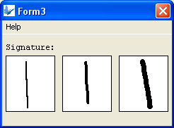
Pen Width
The Pen Width property allows you to specify the width of the pen for a scribble control. It accepts an integer value and the default value is 2.
The following images are scribble control samples with different pen width; 2, 4, and 7 respectively.
Query and Query Column
You can use the Query and Query Column properties to specify the combo box query list. Select the query from the Query property drop down list and the output fields of this query will be available in the Query Column property drop down list. Select the query output column to specify the combo list.
Read Only
The Read Only property causes the field to be read only, meant to display data. Users will not be able to enter data on it. In the case of the listview control, the checkboxes will be read only, but the action events will still be executed.
Save Image As
Determines how the scribble data will be passed around in BrightForms, which can be set as Bitmap or JPEG encoding. The default value for this option is ‘Original’ which will retain the original Bitmap or JPEG encoding of the image loaded into the scribble.
Note that this data is optimised for BrightForms internally. If it needs to be accessed by external applications, decompression measures must be taken, such as specifying the column to be decompressed via mapping in a BrightServer. If the scribble needs to be saved to a file, there are specific Scribble methods to create externally readable files.
Scroll Bar - Horizontal
Set the Horizontal Scroll Bar property of the edit control to True is you want your edit fields with a horizontal scroll bar. This allows for multiple characters and lines to be viewed in the edit field.
Scroll Bar - Vertical
Set the Vertical Scroll Bar property of the edit control to True is you want your edit fields with a vertical scroll bar. This allows for multiple characters and lines to be viewed in the edit field.
Searchable
Set true to allow users to search for strings in the listview. When set to true, BrightForms will signify searchable columns with a magnifying glass icon (see below).
Once a user clicks on this icon, a search dialog will appear, allowing the user to search through the results
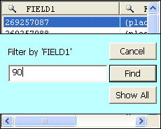
When the results are filtered, the icon will change slightly to indicate that the columns have been filtered.
If Sortable is enabled the Searchable dialog will not appear when clicked.
Selection - Allow Multiple
Set true to allow multiple selections by the user on the listview. Multiple selections will enable users to select more than one field using shift+click and/or ctrl+click operations. Furthermore, the SetSelection() method will not deselect previous selections if called in a method.
Snap To Grid
The Snap To Grid property will have the scribble control operate in 'line mode'. In this mode, tapping and holding in the control will specify the start point of a given line, and the end point for preview. Releasing the hold gesture will commit the line to the control.
When in this mode, co-ordinates for the start and the end points may be specified by the Snap To Grid - Grid Size property, which will align points to the nearest grid point.
Snap To Grid - Grid Size
The value specified for Snap To Grid - Grid Size determines a grid for a scribble control which lines' start and end points must exist on. If points are defined outside of this grid, the points' co-ordinates will be rounded up or down to the nearest grid coordinate.
Line mode, specified by the Snap To Grid property, must be activated for this grid to be in effect.
Sortable
The Sortable property of the list view control allows the users to sort the list content at runtime by clicking on the list view column headers. It will sort the contents in ascending or descending order by the column clicked by the user.
Please note, that this cannot be used in conjunction with Data Grid columns, nor the searchable property of the listview.
Sorted
Set the Sorted property to True to sort the list in a combo box control. This will sort in ascending order or the fixed list or query column.
Style
Use the Style property of the combo box control to specify if the component is a Combo or a Drop Down List. With a Combo you can also enter text aside from selecting from a list. While in the Drop Down List, you can only select from the list.
The Style property of the image control determines the way an image should be displayed within the control. Select from None, Centre, Stretch, Stretch Proportionally and Tile.
Style – Custom Format
The DateTime picker component can have different styles. Using the Style property, you can specify if this component will display the following styles,
Short Date – displays the date in MM/dd/yyyy format
Long Date – displays the date in Day Month dd, yyyy format
Time – displays the time component with hh:mm:ss format
Custom – user defined format
If Custom style was selected, the Style – Custom Format property must also be inputted. The Style – Custom Format property will accept any string. You can display the date in any format that you want with any string prefix or postfix. Use the following parameters to set the Style-Custom Format:
hh – hours in Standard Time
mm – minutes in Standard Time
ss – seconds in Standard Time
HH – hours in Military Time
dd – numeric date
ddd – day of the week using 3 characters
dddd – the complete name for the day of the week.
MM – month
yy - year
See Appendix C for a detailed description of the date-time formatting options.
Tab Order
The Tab Order property accepts an integer to specify a control’s place in the tab order of a form. The first control in the tab order must have a Tab Order of 1 to initiate the tab orders.
Tab order - order in which the TAB key iterates through components.
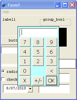
Up-Down Button
Set the Up-Down Button property to True if you want the DateTime picker to have an up-down button displayed upon execution instead of the down arrow button. This property is often used if you want to display or enter a time, as shown below:
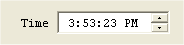
Underline
Determines whether or not a label's caption is rendered with or without an underline. Default is off; false.
Value
The Value property of the radio button accepts an integer to specify the value associated for a radio button in a group. A radio button must have a unique integer value for each group.
Visible
You can use the Visible property to show or hide a control on a form. Set this property to True if you want the form control to be visible upon execution. Select False to hide the control and use an expression in a form or form action to make the control visible after a certain criteria or user input.
Web - Blocking Enabled
Blocking is a property available for listviews when rendered in Web Mode.
When enabled, the listview will display records in segmented blocks, whose size is defined by the 'Web - Block Size Display' property. Both the listview, as well as the blocks may then be scrolled within and navigated through with the navigation buttons at the bottom of the control.
The benefit of this for example is on events such as refresh, the scroll position of the controls with many records cannot be saved due to web limitations. It also reduces the server load, as a smaller result set is loaded each time.
Web - Block Size Display
This property defines the blocking size for web based listviews if both are activated. For example, a size of 20 will show 20 records at a time on each block of the listview.
Web - Wrap Content in Cell
Enabling this property will allow strings that exceed the single vertical
column width defied by listview column widths defined in the column property.
Instead, the content displayed will be done so fully over a number of
lines wrapped in the cell. This is a web feature only.

