Form Control Properties - Listview
Contents Hide
- Font
- Enabled
- Visible
- Tab Order
- List Query
- Columns
- Colour Coding
- Colour - Alternate Rows
- Column Images
- Enable Rules
- Check-box Column
- Action - Single/Double Click
- Action - Selection Change
- Sortable
- Keep Scroll Position
- Read Only
- Data Grid - Auto Save
- Searchable
- Selection - Allow Multiple
- Hide Headers
- Disable Data Load On Form Open
- Disable Data Load When Disabled
- Disable Data Load When Hidden
- Headers - Drag to Reorder
- Web - Blocking Enabled
- Web - Block Size Display
- Web - Wrap Content in Cell
Font
Use the Font property to specify the font, style and size of the form controls.
The default font for BrightBuilder is Arial 12 Plain. Set the default font for all your controls in your project with the Default Font project property.
For more information on Font property, read Changing Fonts in the How To document.
Enabled
Form controls can be enabled or disabled on initial execution with the Enabled property. With this property it is possible to disable for example, a button until data has been changed in an edit control, then use a control action property to call an expression to enable the button.
Set the Enabled property by selecting True from the drop down list.
Visible
You can use the Visible property to show or hide a control on a form. Set this property to True if you want the form control to be visible upon execution. Select False to hide the control and use an expression in a form or form action to make the control visible after a certain criteria or user input.
Tab Order
The Tab Order property accepts an integer to specify a control’s place in the tab order of a form. The first control in the tab order must have a Tab Order of 1 to initiate the tab orders.
Tab order - order in which the TAB key iterates through components.
List Query
Use the List Query property of Listview to identify the query to be used for the list.
Click the listview control in the form Layout tab to display the properties.
In the List Query property box, select the query from the query drop down list.
Once selected, you can change the Columns property of the List Query.
BrightBuilder automatically list all the queries available in the project in the List Query drop down list. When a new query is created, this is made known to all elements that can be attached to a query i.e. listviews and combo boxes.
Columns
The Columns property of Listviews allows alters the way the columns of the query list are to be displayed i.e. column heading, alignment, width or format. There are settings to also include or exclude columns from the List Query.
To modify the Columns property of the List Query:
Select the Listview control from the form Layout tab.
Make sure there is a List Query attached.
In the Columns property box, click on the customizer to display the Property Editor window.
In the Property Editor: Columns window, select the column to modify and do any of the following:
Include/exclude column by ticking or un-ticking the Include checkbox
Change the column header using the Name field. The text typed will be displayed inthe listview header. By default it contains the database table column name.
Select column text alignment. Default is left alignment.
Adjust the column Width display. This is the width of the column in relation to the listviews width. This field contains how many percent of the list view width will be allocated for the column in question.
Change column Format display. This field specifies the format of the column. A date-time or a number value can be formatted by specifying a format string in this field. See Appendix C for date-time and Appendix D number formatting options.
Specify any data grid cells and/or their requirements.
Specify an expression is to be used as a web action.
Click OK to save changes.
The Column field in the Property Editor are the output fields of the query and cannot be modified.
Name field is a string input, if this field is not set, BrightBuilder will use the query output field name. This field can be left blank, i.e. no header.
Width field is a numeric value and will not accept any alpha-characters. When user inputs a character, cell border will become red and will not save user input.
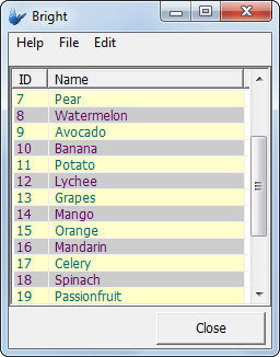
Colour Coding
Listviews may have their rows individually colour coded, depending on the column values of the data contained in each row. The Colour Coding property of a listview allows users to change how this colour coding is executed. Editing this property will result in the following window:
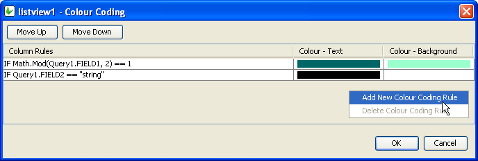
As shown, adding new Colour Coding Rules and deleting unnecessary ones is handled by the Right-Clicked context menu.
Several colour rules may be assigned to a particular list view, however each row may only have one colour assigned to it. When defining the colour coding of a listview, be aware that the Column Rules are executed in order, and the first match to a column rule will result in that colour change to the row in question. To change this order, use the 'Move Up/Down' buttons.
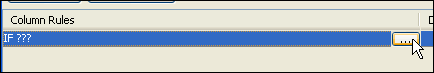
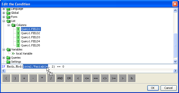
Editing a rule via its ellipsis will bring up the 'Edit the Condition dialog'. Here, operands may be dragged and dropped from the data source tree into the condition. Unlike a typical DST, the DST used in listiviews' condition editing includes a 'List > Columns' folder, which is to used to look up field values based on each row of the listview.
Once the conditions are set, the Colour Background and Colour text of the row is set in a similar fashion to labels or edit controls.
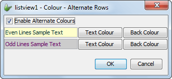
Colour - Alternate Rows
Row colouring independent of row data values may be implemented using the 'Alternate Row Colouring' property of the listview control. Here, the setting may be enabled, with the text/background combinations for even and odd rows able to be set. This will take place in the row prior to any other colour settings taking place. The dialog also contains lines of sample text to preview the colours chosen, as shown below. By default, this property is set to False.
Column Images
This property displays an image on the left most column of a listview's rows to show importance or status of the row depending on the image depicted. Editing this property of the listview is handled by the following Column Images dialog:
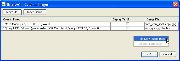
As shown, adding new Column Rules and deleting unnecessary ones for the Column Images is handled by the Right-Clicked context menu.
Several images may be assigned to a particular list view, however each row may only have one image assigned to it. Therefore the Column Rules are executed in order, and the first match to a column rule will result in that image displayed for the row in question . To change this order, use the 'Move Up/Down' buttons.
Clicking on the ellipsis of a newly added Image Rule will open up that rule for editing.
Editing a rule will bring up the 'Edit the Condition dialog'. Here, operands may be dragged and dropped from the data source tree into the condition. Unlike a typical DST, the DST used in listivews' condition editing includes a 'List' folder, which us to used to look up field values based on each row of the listview.
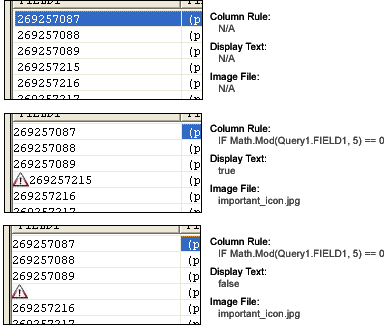
Once set, exactly what image and how it should be displayed can be changed using the 'Display Text' and 'Image File' columns Below are diagrams about how the settings are processed and rendered BrightForms.
Enable Rules
Enable rules are a list of column rules. Typically, single and double click operations are available for all rows in a listview. Ie. they all will have their 'Action - Single/Double click' events or expressions enabled. However, if a listview has any enable rules, all rows will have these operations disabled except any rows which satisfy the conditions of these rules.
Adding or deleting column rules listed under the Enable Rules dialog is handled by the right-click context menu. Rules may then be edited via the use of the ellipsis Also in this dialog, precedence may also be changed using the 'Move Up/Down' buttons.
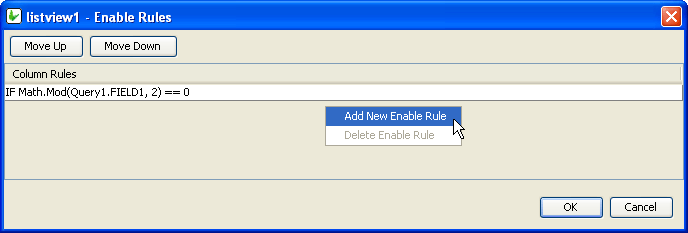
Editing a rule will bring up the 'Edit the Condition dialog'. Here, operands may be dragged and dropped from the data source tree into the condition. Unlike a typical DST, the DST used in listivews' condition editing includes a 'List' folder, which us to used to look up field values based on each row of the listview.
Therefore, if the above "IF Math.Mod(Query1.FIELD1, 2) == 0" statement was defined in the Enable Rules dialog, only even number will be able to
Check-box Column
The Check-box Column property of the list view allows a column to be displayed as a checkbox. The field that is specified as a check-box column should be a boolean, integer or double data type. When the checkbox is ticked the state of the checkbox is stored immediately into the database table column.
Action - Single/Double Click
Use the Action – Double Click or the Action – Single Click properties of the listview control to run an expression or open a form when the user presses and releases the left mouse button twice over the listview within the double-click time limit of the system (for a double click) or when the user presses and releases the mouse button once (for single click).
This property commonly used when wanting to open the record (on another form) of the row selection.
This expression, however, will not be enabled if the row selected meets any conditions defined in 'Enable Rules' property.
Action - Selection Change
Use the Action-Selection Change property to run an expression or open a form when the user changes the selection from the combo list. The listview also has an Action-Selection Change property to run an expression or open a form when the Up/Down keys on the keyboard are pressed.
This expression, however, will not be enabled if the row selected meets any conditions defined in 'Enable Rules' property.
Sortable
The Sortable property of the list view control allows the users to sort the list content at runtime by clicking on the list view column headers. It will sort the contents in ascending or descending order by the column clicked by the user.
Please note, that this cannot be used in conjunction with Data Grid columns, nor the searchable property of the listview.
Keep Scroll Position
This property gives you the option to keep current scroll position after refresh.
Read Only
The Read Only property causes the field to be read only, meant to display data. Users will not be able to enter data on it. In the case of the listview control, the checkboxes will be read only, but the action events will still be executed.
Data Grid - Auto Save
With the 'Columns' property of the Listview, the 'Data Cell' columns may be defined such that each field under the column maybe edited, thus providing individual editable controls within each listview RowColumns. Each of these controls have specific properties to the equivalent form control, which can be modified to suit the application requirements.
If these type of columns are enabled, The Data Grid -Auto Save property of the listview allows the automatic saving of each grid data when the control has lost focus. It's default value is 'false' or disabled.
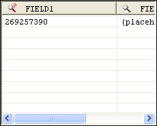
Searchable
Set true to allow users to search for strings in the listview. When set to true, BrightForms will signify searchable columns with a magnifying glass icon (see below).
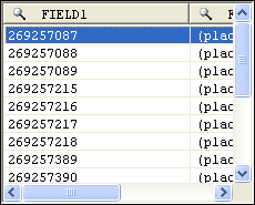
Once a user clicks on this icon, a search dialog will appear, allowing the user to search through the results
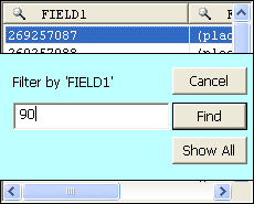
When the results are filtered, the icon will change slightly to indicate that the columns have been filtered.
If Sortable is enabled the Searchable dialog will not appear when clicked.
Selection - Allow Multiple
Set true to allow multiple selections by the user on the listview. Multiple selections will enable users to select more than one field using shift+click and/or ctrl+click operations. Furthermore, the SetSelection() method will not deselect previous selections if called in a method.
Disable Data Load On Form Open
Set true to not run the query of the control when it first loads on the form. As such, the control’s values will only populate when the Refresh() method is called in an expression. This is best used to disable unnecessary loading on large queries for listviews and combo boxes.
Disable Data Load When Disabled
Data will not be loaded by the Refresh() method or otherwise if this value it set to true and this control is disabled.
Disable Data Load When Hidden
Data will not be loaded by the Refresh() method or otherwise if this value it set to true and this control is hidden.
Headers - Drag to Reorder
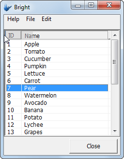
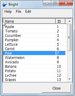
Setting the ''Headers - Drag to Reorder' setting to true will allow users to click on any column header in the list view and re-order it left and right in the form by dragging. Valid positions are marked by a darkened separator between column headings. Releasing the column heading in a valid position will result in the reordering of the listviews columns. This change, like column widths, are saved in the registry and persisted until reedited.

Web - Blocking Enabled
Blocking is a property available for listviews when rendered in Web Mode.
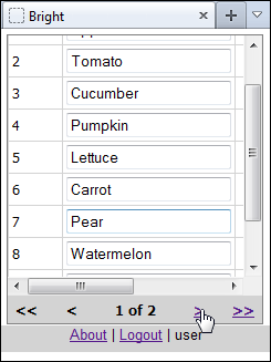
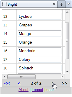
When enabled, the listview will display records in segmented blocks, whose size is defined by the 'Web - Block Size Display' property. Both the listview, as well as the blocks may then be scrolled within and navigated through with the navigation buttons at the bottom of the control.
The benefit of this for example is on events such as refresh, the scroll position of the controls with many records cannot be saved due to web limitations. It also reduces the server load, as a smaller result set is loaded each time.
Web - Block Size Display
This property defines the blocking size for web based listviews if both are activated. For example, a size of 20 will show 20 records at a time on each block of the listview.
Web - Wrap Content in Cell
Enabling this property will allow strings that exceed the single vertical
column width defied by listview column widths defined in the column property.
Instead, the content displayed will be done so fully over a number of
lines wrapped in the cell. This is a web feature only.