Quick Tutorial - Form Controls and Layout
Description
Tutorial which introduces some basic controls used to make a simple selector, and how to position them in order to produce a user-friendly interface.
Resources
Creating a New Form
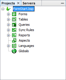
After creating a new project, it should appear in the Projects panel of the BrightBuilder interface. If you expand this tree view, you will note that a project consists of several elements, which each work in conjunction with one another, and will be explored in this tutorial set.
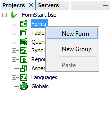
Create a new form with this tree by right-clicking the ‘Forms’ element and selecting ‘New Form’. If there is no default form size set, the user will be prompted to set this project property. After this, a new form will be created, named ‘Form1’ and will open in the workspace. As it is the first form, it will also be set as the project’s main form.
Adding Controls to the Layout
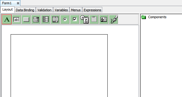
A form is comprised of several controls, each performing different roles and functionality in a given application. The green toolbar shows all the controls available to use, and you can use BrightBuilder’s drag and drop interface to add them to a form. The space available to drag and drop into, ie the form’s bounds, are represented by the raised area in the workspace, and a dotted blue line indicates where the device’s SIP keyboard will appear.
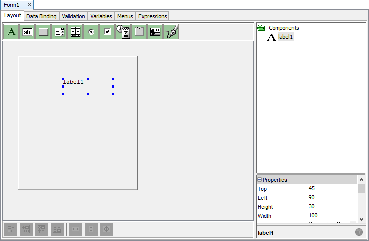
Drag and drop a text label onto the form. A new label control called ‘label1’ should now appear both in the form and in the components tree of the form.
Control Selection
You may select a control in a form by clicking on it. Once selected, a control may be dragged and dropped within the form’s bounds. The blue tabs indicate the bounds or size of a particular object within the form layout, and dragging and dropping these points will change these bounds.
Once selected, a control’s reference name will be highlighted in the ‘Components’ section and its properties will also display in the properties area, and these can be further edited further or modified.
Properties
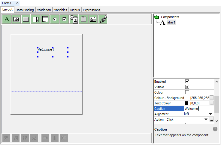
Depending on the type of control, a range of properties may be edited by simply clicking on the property, and changing the values listed. This allows developers to implement and configure interfaces with a wide, yet also specified set of behaviours and functionality. The description of each property is given in the information box at the bottom of the sidebar.
For example, if we wanted to change the text the user sees in the application from “label1” to “Welcome!”, we need to locate the ‘Caption’ property and change it to this string.
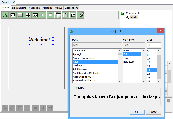
The ellipsis button indicates the editing of a property through a dialog box. Therefore, if we want to specify a font, we need to use the font selector with the ellipsis button, bringing up the dialog below.
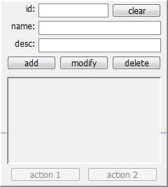
Exercise
From the FormStart.bsp, try to create the following form below, using buttons, edit controls and a listview. The font is set as Tahoma 10, and the action buttons are set as disabled. You may check the solution with the FormFinished.bsp file.