Quick Tutorial - Layout Orientations and Resolutions with Aspects
Description
This tutorial describes how to a create form with multiple layouts, which are optimised for different resolutions and changing screen orientations, via BrightBuilder’s aspects.
Resources
Layouts in Bright Builder
BrightBuilder allows developers to produce applications that can display different form layouts depending on the resolution of the screen or the orientation of the device. This is handled by utilising Aspects in BrightBuilder, which act as templates for alternate form layouts.
While vastly different alternate layouts can be created, the controls themselves and the expressions within a form stay constant, and thus the form’s functionality remains the same. The layout to be used in the form is automatically detected by BrightForms when the form opens, with the closest resolution matching the device's screen size being selected. This allows a single application to run with the exact same logic across multiple devices, independent of screen size or visual look/feel.
Below are screenshots from an example application configured to run on (left to right) Windows Phone 8, iOS7 and on a Windows Surface device. Each layout is configured to adopt the system's look and feel, while still retaining the same functionality for all controls.

Orientation changes, and working space changes on devices are also listened to and adapted to by BrightForms, automatically adapting by applying the most suitable aspect, providing a seamless transition between views.
Below is an example of an aspect change triggered by orientation. In this example, the Windows Phone device is rotated counter clockwise, and the form adapts accordingly.
Defining an Aspect
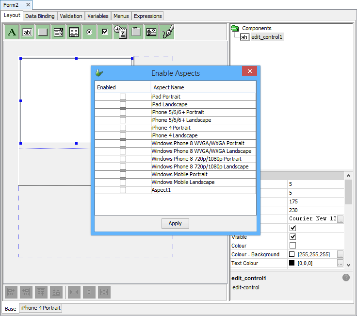
Aspects may be added to the project via the project properties, and serve as templates when they are added to a form. The default aspects for a range of devices, including iPads and Windows Mobile devices, are available by default to a project's aspects, and appear for all projects in this editor. The width and height columns in this table determines the default height and width the aspect will have when initially added to a form.


Below this table of project aspects is an additional table allowing a combination of client browser identifiers and mobile device scales. When the application runs, if its client identifier is matched against an identifier in this table, the corresponding aspect and scale for that particular browser or device will be loaded, at the scale specified. For more information on specifying this string, please refer to the BrightBuilder > Form Aspects section of the Bright Software User Manual.
Assigning an Aspect
Once an aspect has been defined, you can add it to a form using the right-click context menu in a given form. Here, a dialog will appear displaying what aspects you wish to activate or deactivate on any given form, represented by the checkboxes.
The layout will then be added as a tab at the bottom of the screen with the name the aspect that been chosen. It will also have the dimensions defined by the template as default.
The form’s previous main layout will then be shown as ‘Base’ which has the resolution defined by the form’s height and width properties. If you wish to make changes to the aspects enabled/disabled in a form once more, you must reopen the previous dialog through this ‘base’ form.

Finally, when on a form aspect, a new aspects may be copied from it using the 'Close Aspect' option in the context menu. This will add the selected aspect to the form, with controls' position from the cloned aspect.
Aspect Detection on Devices
When BrightForms loads a form, it will perform a check on the available screen area of the device, and load the aspect closest to this screen size out of a form's available aspects. For each BrightBuilder project, a range of device dimensions will be supplied under the project's aspect panel by default.
The aspect loading process is also repeated if the screen dimensions change during BrightForms' operation, such as when window multitasking is performed for Windows Store Apps, or when the device is rotated from landscape to portrait, or vice versa. This change will take effect for all opened forms in BrightForms.
For BrightWeb, the screen size is determined by the actual device's screen, and not the browser window.
While aspect switching in an application is usually handled automatically, matching the closest form size with the device, aspects may also be set manually in expressions using the System object method SetDefaultAspect(). This takes in the aspect name as a string value, and if valid, sets the aspect for subsequently opened forms. This setting will also be persisted across BrightForms sessions, until reset with a non-existing aspect name (i.e. an invalid parameter), or if supplied with an empty string.
Editing Within Aspects
The dashed blue line represents the region outside of the aspect, but which may exist and contain controls in other aspects. Any control in this region may thus display in other forms correctly, but will not appear in this form. As with typical forms, the raised border denotes the aspect’s bounds, and can be resized accordingly with the drag and drop or the right-click context menu when the cursor is out of the raised bounds.
The screen resolution size is noted upon each open or screen rotation event of a given form, and the appropriate form layout, ie. one which maximises the screen space of a given device, will be used accordingly. Therefore, no logic or scripting is needed to perform this operation; it is all handled by BrightForms.
Controls Within Aspects
As controls in BrightBuilder contain vital information pertaining to a form’s functionality, all controls must be present in all aspects. Therefore, when a new aspect is created, all controls in the base form will be replicated as is, and their function – and therefore the form’s functionality, will be consistent regardless of the aspects applied. Adding controls to the form will also add them to all other aspects, and deleting them will have the same effect.
However, there is a subset of properties which may be modified within aspects and any changes to these properties will be unique to the particular aspect. These properties are typically of a visual nature which will not affect the form’s overall function. Position, height and width are properties of all controls which fit this criterion and they can simply be modified by dragging and dropping in the WYSIWYG layout editor. Depending on the type of control, different subsets of properties may be altered, yet in all cases leaving the form’s main function in tact.
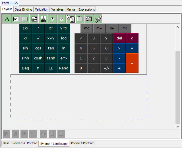
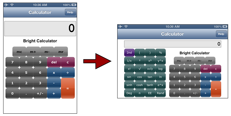
If you want a control to be active or inactive, shown or hidden on a particular form, the hide/show and enable/disable properties can be used when to limit the amount of controls needed in a particular layout of a form. This is primarily useful for controls used for decoration, but creatively using these properties may also result in more dynamic functionality in forms, for example, with the calculator form below.
Exercise
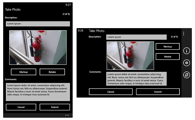
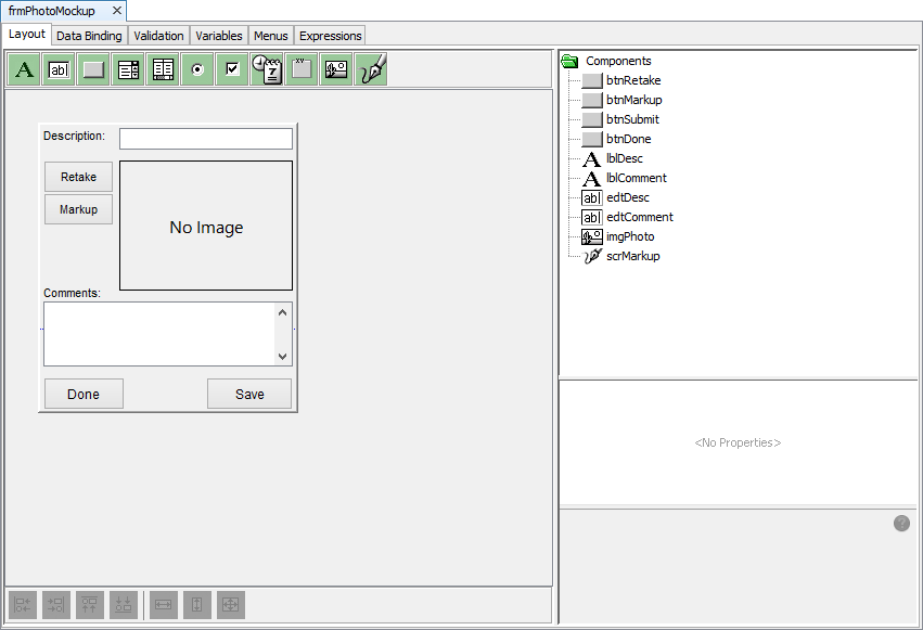
The attached AspectsStart.bsp contains a main menu, and a photo taking/mark up form. The photo form allows the user to take a photo, add a description and comments, then optionally mark up the image via scrollable scribble control. Changes may then be committed, and the record saved . A single photo on each device may be stored/modified at any given time. Clearing the image stored is handled by the main menu form.
The project's initial layout is as shown below. It is in the Windows Mobile aspect of 240x268 points.
With a target device in mind, apply a new aspect to the photo form. For example, an implementation for iPhone 5 portrait dimensions in may be defined as follows:
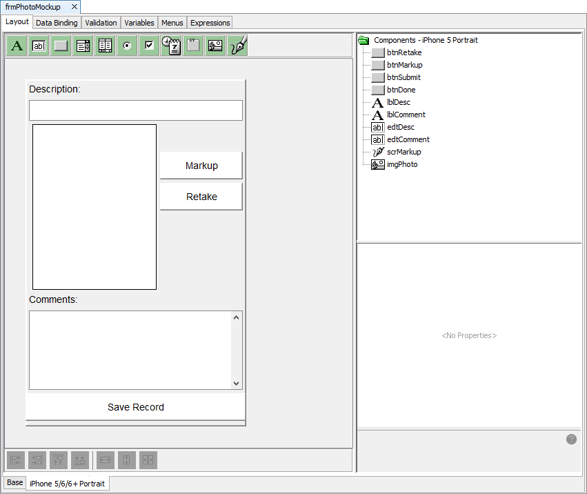
Note the following changes in particular:
Resized fonts
Resized/repositioned controls
Altered button colours (in line with iOS7/8)
Hidden 'Done' button (as iOS has a prominent button in the toolbar)
All the logic of the form is kept in-tact. This example is included in AspectFinished.bsp.