Form Control Properties - Image
Contents Hide
Font
Use the Font property to specify the font, style and size of the form controls.
The default font for BrightBuilder is Arial 12 Plain. Set the default font for all your controls in your project with the Default Font project property.
For more information on Font property, read Changing Fonts in the How To document.
Enabled
Form controls can be enabled or disabled on initial execution with the Enabled property. With this property it is possible to disable for example, a button until data has been changed in an edit control, then use a control action property to call an expression to enable the button.
Set the Enabled property by selecting True from the drop down list.
Visible
You can use the Visible property to show or hide a control on a form. Set this property to True if you want the form control to be visible upon execution. Select False to hide the control and use an expression in a form or form action to make the control visible after a certain criteria or user input.
Tab Order
The Tab Order property accepts an integer to specify a control’s place in the tab order of a form. The first control in the tab order must have a Tab Order of 1 to initiate the tab orders.
Tab order - order in which the TAB key iterates through components.
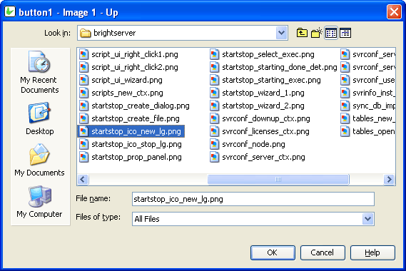
Image - Filename
Use the Image – Filename property to select and import an image file to the bitmap control on the form layout.
Click on the customiser button to display the "bitmap1 - Image - Filename" dialog box shown below to select the BMP or JPG file to import and click OK.
Images are saved in the project bsp file together with the application definitions.
Style
Use the Style property of the combo box control to specify if the component is a Combo or a Drop Down List. With a Combo you can also enter text aside from selecting from a list. While in the Drop Down List, you can only select from the list.
The Style property of the image control determines the way an image should be displayed within the control. Select from None, Centre, Stretch, Stretch Proportionally and Tile.
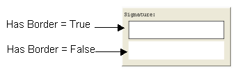
Has Border
The Has Border property applies a thin black border around the scribble and bitmap control. The default value for this property is True. Simply select False from the drop down list if to have no border around the scribble control.
The following image is two samples of a scribble control and will shows the difference when the Has Border property is set to True or False.
Has Scroll Bars
The Has Scroll Bars property of the bitmap and scribble controls allows the application users to scroll through a big bitmap or picture. Unless the bitmap displayed is bigger than the control size the scroll bars will not be shown.
Cache Image
If the Cache Image property is set to true, a base64binary image from an image control can be used in an expression to assign an image value to a variable or any other operand in a Form Expression. This is to optimise memory management on mobile devices, but defaults as true regardless when loading on desktop. It is necessary to save images in forms to the database.