Form Control Properties - Edit Control
Contents Hide
- Font
- Enabled
- Visible
- Tab Order
- Multi-Line
- Max Length
- Alignment
- Password
- Number
- Number - Max
- Number - Min
- Number - Precision
- Scroll Bar - Horizontal
- Scroll Bar - Vertical
- Default Value
- Action – Text Change
- Action – Got/Lost Focus
- Read Only
- Colour
- Colour - Background
- Colour - Text
- Format
- Launch Software Keyboard
- Numeric Keypad
- Mask
- Mask – Include Mask
- Mask – Place Holder
- Multi-Line Auto-Scroll
- Web - File Input
Font
Use the Font property to specify the font, style and size of the form controls.
The default font for BrightBuilder is Arial 12 Plain. Set the default font for all your controls in your project with the Default Font project property.
For more information on Font property, read Changing Fonts in the How To document.
Enabled
Form controls can be enabled or disabled on initial execution with the Enabled property. With this property it is possible to disable for example, a button until data has been changed in an edit control, then use a control action property to call an expression to enable the button.
Set the Enabled property by selecting True from the drop down list.
Visible
You can use the Visible property to show or hide a control on a form. Set this property to True if you want the form control to be visible upon execution. Select False to hide the control and use an expression in a form or form action to make the control visible after a certain criteria or user input.
Tab Order
The Tab Order property accepts an integer to specify a control’s place in the tab order of a form. The first control in the tab order must have a Tab Order of 1 to initiate the tab orders.
Tab order - order in which the TAB key iterates through components.
Multi-Line
You can use the Multi-line property of edit control to allow multiple lines to be displayed or entered. When this property is set to True, BrightForms can identify the (new line) character.
Max Length
The Max Length property of an edit control and combo box accepts an integer to limit the number of characters entered by the user.
The default value is zero which indicates that the control has unlimited character length (limited to the number of characters that the operating system can handle).
You use this property in conjunction with the string length of your table column fields.
Alignment
Select the type of text alignment in a label and edit control.
Open the form in the Source Editor window
Select the control in the form Layout tab; the Component panel will display the control properties.
In the Alignment property box, click Left, Centre or Right. Changes will automatically be reflected in the form layout.
Password
Set the Password property to True if you want the edit control to be a password text field. When the user enters a text, the characters are displayed as a series of asterisk (*)
This property will not be implemented if the Multi-line property is True.
Number
Set the Number property of edit control or combobox to True to specify that the field can only accept integer or double values.
Number - Max
Set the maximum numerical value the control can contain. This is validated on a database save.
Number - Min
Set the minimum numerical value the control can contain. This is validated on a database save.
Scroll Bar - Horizontal
Set the Horizontal Scroll Bar property of the edit control to True is you want your edit fields with a horizontal scroll bar. This allows for multiple characters and lines to be viewed in the edit field.
Scroll Bar - Vertical
Set the Vertical Scroll Bar property of the edit control to True is you want your edit fields with a vertical scroll bar. This allows for multiple characters and lines to be viewed in the edit field.
Default Value
Use the Default Value property of an edit control or combo box to specify a value that will be automatically displayed and entered in the edit/combo box control object or in the table columns if the control is data bound. For example, if most of your suppliers are in NSW, you could set the STATE field of the SUPPLIERS table to have a default value of “NSW”. You can accept the default value or type a new value over it.
Set the Default Value property by simply typing the value in text field provided
Whereas the Default Value property for the check box controls specifies if the control will initially be true or false.
Action – Text Change
The Action-Text Change property will execute an expression or open a form when there is a text change in the combo box or edit control.
Action – Got/Lost Focus
The Action – Got Focus property runs an expression or opens a form when a control receives the focus from the user through the mouse or keyboard. While Action – Lost Focus will run an expression or open a form when it loses the focus.
For example, by attaching a Got Focus expression to a control on a form, you can guide the user through your application by displaying brief instructions or messages in a text box. You can also provide visual cues by enabling, disabling, or displaying controls that depend on the control with the focus or without the focus.
A control can receive the focus only if its Visible and Enabled property is set to True.
These properties applies to the combo box, radio button, check box, dateTime picker, button and edit controls.
Read Only
The Read Only property causes the field to be read only, meant to display data. Users will not be able to enter data on it. In the case of the listview control, the checkboxes will be read only, but the action events will still be executed.
Colour
This property enables the background and text colour of the edit and label controls.
Set the Colour – Background and/or Colour – Text properties to the colour required then simply set the Colour property to true to enable and display the colours specified.
Set the Colour property by selecting True from the drop down list.
Colour - Background
Colour - Background property allows specification of a background colour for the label, edit and scribble controls.
Select the background colour by clicking on the customizer button to display the Colour - Background property editor like the one below:

Select the desired colour from the property editor window, it is also possible to change the HSB, RGB, AWT Swing and System Palette. Then click OK to continue.
Scribble background colour will automatically be enabled once the Colour – Background property has been set.
Enable the background colour for the edit and label by selecting True in the Colour property.
Colour - Text
Use the Colour - Text property to change the text colour for the label and edit control.
To change the text colour, click on the customise button to display the following dialog:

Select the desired colour and click OK.
Make sure to enable the text colour by selecting True in the Colour property. .
Format
This field specifies the format of the edit control. A date-time or a number value can be formatted by specifying a format string in this field. See Appendix C for date-time and Appendix D number formatting options.
Launch Software Keyboard
The Launch Software Keyboard property displays the software keyboard upon project execution on the Pocket PC when an edit or combo box control gets the focus. This allows for user input convenience without having to click on the software keyboard located at the bottom of the screen. The default value is True.
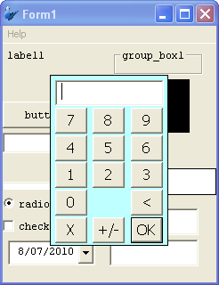
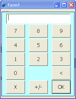
Numeric Keypad
Launches a numeric keypad, either small or large, on device. Default setting is 'None'.
Mask
A Mask acts as a filter that can selectively include or exclude certain characters or values. For example, when defining a database field, it is possible to assign a mask that indicates what sort of value the field should hold. Values that do not conform to the mask cannot be entered.
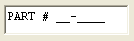
The Mask property in Bright Applications is a character based masked edit control; you can set the mask for each character. For example, you may have a 6-digit part number, where the first digit can only be a vowel, the second digit can only be the letters B, C or D and the remaining digits can be 0 through 9 inclusive.
The mask is constructed so that each character is inside the brackets, and all static characters (characters not entered by the user) are outside the brackets. Dashes can be used inside the brackets to indicate a range of characters.
The mask for the 6-digit part number, where the first digit can only be a vowel, the second digit can only be the letters B, C or D and the remaining digits can be 0 through 9 inclusive would look like this,
[AEIOUaeiou][BCD][0-9][0-9][0-9][0-9]
You can also append static characters in the mask, for example:
PART# [AEIOUaeiou]-[BCD][0-9][0-9][0-9][0-9]
Upon execution, the edit control will look like this:
Mask – Include Mask
The Mask – Include Mask property of the edit control is a flag that allows you to include or exclude the mask characters as part of the input. Default value is True. For example, suppose the mask PART# [AEIOUaeiou]-[BCD][0-9][0-9][0-9][0-9] is given the valid input “PART# A-B0000”. If Include Mask is true, then the actual value passed will be “PART# A-B0000”, otherwise it would be
“AB0000”, with the mask characters stripped.
Mask – Place Holder
In this edit control property, you can select the character to appear where input is required. The default character is an underscore ( _ ). A space is equivalent to an underscore.

