Form Control Properties - DateTime Picker
Contents Hide
Font
Use the Font property to specify the font, style and size of the form controls.
The default font for BrightBuilder is Arial 12 Plain. Set the default font for all your controls in your project with the Default Font project property.
For more information on Font property, read Changing Fonts in the How To document.
Enabled
Form controls can be enabled or disabled on initial execution with the Enabled property. With this property it is possible to disable for example, a button until data has been changed in an edit control, then use a control action property to call an expression to enable the button.
Set the Enabled property by selecting True from the drop down list.
Visible
You can use the Visible property to show or hide a control on a form. Set this property to True if you want the form control to be visible upon execution. Select False to hide the control and use an expression in a form or form action to make the control visible after a certain criteria or user input.
Tab Order
The Tab Order property accepts an integer to specify a control’s place in the tab order of a form. The first control in the tab order must have a Tab Order of 1 to initiate the tab orders.
Tab order - order in which the TAB key iterates through components.
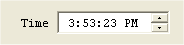
Up-Down Button
Set the Up-Down Button property to True if you want the DateTime picker to have an up-down button displayed upon execution instead of the down arrow button. This property is often used if you want to display or enter a time, as shown below:
Style – Custom Format
The DateTime picker component can have different styles. Using the Style property, you can specify if this component will display the following styles,
Short Date – displays the date in MM/dd/yyyy format
Long Date – displays the date in Day Month dd, yyyy format
Time – displays the time component with hh:mm:ss format
Custom – user defined format
If Custom style was selected, the Style – Custom Format property must also be inputted. The Style – Custom Format property will accept any string. You can display the date in any format that you want with any string prefix or postfix. Use the following parameters to set the Style-Custom Format:
hh – hours in Standard Time
mm – minutes in Standard Time
ss – seconds in Standard Time
HH – hours in Military Time
dd – numeric date
ddd – day of the week using 3 characters
dddd – the complete name for the day of the week.
MM – month
yy - year
See Appendix C for a detailed description of the date-time formatting options.
Style
Use the Style property of the combo box control to specify if the component is a Combo or a Drop Down List. With a Combo you can also enter text aside from selecting from a list. While in the Drop Down List, you can only select from the list.
The Style property of the image control determines the way an image should be displayed within the control. Select from None, Centre, Stretch, Stretch Proportionally and Tile.
Action – DateTime Change
The Action-DateTime Change property is used to execute an expression or open a form when the DateTime picker component has been changed.
Action – Got/Lost Focus
The Action – Got Focus property runs an expression or opens a form when a control receives the focus from the user through the mouse or keyboard. While Action – Lost Focus will run an expression or open a form when it loses the focus.
For example, by attaching a Got Focus expression to a control on a form, you can guide the user through your application by displaying brief instructions or messages in a text box. You can also provide visual cues by enabling, disabling, or displaying controls that depend on the control with the focus or without the focus.
A control can receive the focus only if its Visible and Enabled property is set to True.
These properties applies to the combo box, radio button, check box, dateTime picker, button and edit controls.
Web Year Range Enabled
In web mode, select whether the start and end of year range is explicitly specified. If disabled, the selectable years will be a moving window of plus and minus 20 years from the selected date. If enabled, selectable dates will be set using the Web Year Range Start and End properties, with the initial date being the Range Start value.