Form Control Properties - Combo Box
Contents Hide
- Font
- Enabled
- Visible
- Tab Order
- Max Length
- Drop Down Size
- Style
- Sorted
- Launch Software Keyboard
- List Reference
- Query and Query Column
- Fixed List
- Action – Text Change
- Action – Selection Change
- Action – Got/Lost Focus
- Default Selection
- Default Value
- Number
- Number - Max
- Number - Min
- Number - Precision
- Disable Data Load On Form Open
- Disable Data Load When Disabled
- Disable Data Load When Hidden
Font
Use the Font property to specify the font, style and size of the form controls.
The default font for BrightBuilder is Arial 12 Plain. Set the default font for all your controls in your project with the Default Font project property.
For more information on Font property, read Changing Fonts in the How To document.
Enabled
Form controls can be enabled or disabled on initial execution with the Enabled property. With this property it is possible to disable for example, a button until data has been changed in an edit control, then use a control action property to call an expression to enable the button.
Set the Enabled property by selecting True from the drop down list.
Visible
You can use the Visible property to show or hide a control on a form. Set this property to True if you want the form control to be visible upon execution. Select False to hide the control and use an expression in a form or form action to make the control visible after a certain criteria or user input.
Tab Order
The Tab Order property accepts an integer to specify a control’s place in the tab order of a form. The first control in the tab order must have a Tab Order of 1 to initiate the tab orders.
Tab order - order in which the TAB key iterates through components.
Max Length
The Max Length property of an edit control and combo box accepts an integer to limit the number of characters entered by the user.
The default value is zero which indicates that the control has unlimited character length (limited to the number of characters that the operating system can handle).
You use this property in conjunction with the string length of your table column fields.
Drop Down Size
The Drop Down Size property of the combo box sets the maximum number of rows to display in the combo box.
The Drop Down Size holds an integer value with 5 as its default setting. Set this property by using the combo box’s property list in the Component panel window.
If the actual number of rows exceeds the number specified by the Drop Down Size property setting, a vertical scroll bar appears in the combo box.
Style
Use the Style property of the combo box control to specify if the component is a Combo or a Drop Down List. With a Combo you can also enter text aside from selecting from a list. While in the Drop Down List, you can only select from the list.
The Style property of the image control determines the way an image should be displayed within the control. Select from None, Centre, Stretch, Stretch Proportionally and Tile.
Sorted
Set the Sorted property to True to sort the list in a combo box control. This will sort in ascending order or the fixed list or query column.
Launch Software Keyboard
The Launch Software Keyboard property displays the software keyboard upon project execution on the Pocket PC when an edit or combo box control gets the focus. This allows for user input convenience without having to click on the software keyboard located at the bottom of the screen. The default value is True.
Query and Query Column
You can use the Query and Query Column properties to specify the combo box query list. Select the query from the Query property drop down list and the output fields of this query will be available in the Query Column property drop down list. Select the query output column to specify the combo list.
Fixed List
The Fixed List property can specify a fixed list of values for a combo box control. When a fixed list is used, the values displayed in the combo box are not bound to a table column. For example, you know that there are only eight states/territories in Australia; you can create a fixed list for the State combo box that will be saved in the STATE table column.
To enter a fixed list, click on the customise button to invoke the Property Editor – Fixed List dialog below.
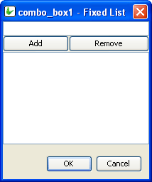
Enter a value or text in the field and click Add, the text entered will be included in the fixed list table. Add all the text required in the list and click OK to return to BrightBuilder development window.
To remove a text from the list, simply select the text from the fixed list table and click Remove in the Property Editor – Fixed List dialog.
Action – Text Change
The Action-Text Change property will execute an expression or open a form when there is a text change in the combo box or edit control.
Action – Selection Change
Use the Action-Selection Change property to run an expression or open a form when the user changes the selection from the combo list. The listview also has an Action-Selection Change property to run an expression or open a form when the Up/Down keys on the keyboard are pressed.
This expression, however, will not be enabled if the row selected meets any conditions defined in 'Enable Rules' property.
Action – Got/Lost Focus
The Action – Got Focus property runs an expression or opens a form when a control receives the focus from the user through the mouse or keyboard. While Action – Lost Focus will run an expression or open a form when it loses the focus.
For example, by attaching a Got Focus expression to a control on a form, you can guide the user through your application by displaying brief instructions or messages in a text box. You can also provide visual cues by enabling, disabling, or displaying controls that depend on the control with the focus or without the focus.
A control can receive the focus only if its Visible and Enabled property is set to True.
These properties applies to the combo box, radio button, check box, dateTime picker, button and edit controls.
Default Selection
The Default Selection property of the radio box triggers the initial value for the group of radio boxes in the form upon execution. Select TRUE or FALSE to set this property. Once a radio box is set as the default selection, it will be marked upon execution. Only one radio box can be the default selection for a group.
The Default Selection property of the combo box specifies the initial selection for the combo box. This has an integer value and is defaulted to 0 - the first value on the combo list. To make no selection, enter -1 for this property.
Default Value
Use the Default Value property of an edit control or combo box to specify a value that will be automatically displayed and entered in the edit/combo box control object or in the table columns if the control is data bound. For example, if most of your suppliers are in NSW, you could set the STATE field of the SUPPLIERS table to have a default value of “NSW”. You can accept the default value or type a new value over it.
Set the Default Value property by simply typing the value in text field provided
Whereas the Default Value property for the check box controls specifies if the control will initially be true or false.
Number
Set the Number property of edit control or combobox to True to specify that the field can only accept integer or double values.
Number - Max
Set the maximum numerical value the control can contain. This is validated on a database save.
Number - Min
Set the minimum numerical value the control can contain. This is validated on a database save.
Disable Data Load On Form Open
Set true to not run the query of the control when it first loads on the form. As such, the control’s values will only populate when the Refresh() method is called in an expression. This is best used to disable unnecessary loading on large queries for listviews and combo boxes.