Form Control Properties - Button
Contents Hide
Font
Use the Font property to specify the font, style and size of the form controls.
The default font for BrightBuilder is Arial 12 Plain. Set the default font for all your controls in your project with the Default Font project property.
For more information on Font property, read Changing Fonts in the How To document.
Enabled
Form controls can be enabled or disabled on initial execution with the Enabled property. With this property it is possible to disable for example, a button until data has been changed in an edit control, then use a control action property to call an expression to enable the button.
Set the Enabled property by selecting True from the drop down list.
Visible
You can use the Visible property to show or hide a control on a form. Set this property to True if you want the form control to be visible upon execution. Select False to hide the control and use an expression in a form or form action to make the control visible after a certain criteria or user input.
Tab Order
The Tab Order property accepts an integer to specify a control’s place in the tab order of a form. The first control in the tab order must have a Tab Order of 1 to initiate the tab orders.
Tab order - order in which the TAB key iterates through components.
Caption
The Caption property is used to provide helpful information to the user through captions on objects in various views:
Form captions are the text that appears in the title bar of the executable form.
Label, Button, Radio box, Check box and Group box captions specify the text that appears in the control.
The Caption property is a string input. For controls, set this property in the Properties view in the Component panel. Form captions can be set in the Properties view of the Explorer window.
If the caption to a control or form is not specified, BrightBuilder will assign the default name of the object as its caption.
Image
Set the Image property of the button to True to indicate that the control is an image button. This will display the image file imported in the Image 1 – Up property. The default value is False.
Image 1 – Up
Use the Image 1 – Up property to select and import the image file to be used for the button in the UP position.
Image 2 – Down (optional)
Use the Image 2 – Down property to select and import the image file to be used for the button in the DOWN position. This is an optional property to change the image button when the button is clicked.
Image 3 – Focused (optional)
The Image 3 – Focused property is an optional property to select and import the image file for the button when it is in focus.
Image 4 – Disabled (optional)
The Image 4 – Disabled property is an optional property to select and import the image file for the button when it is disabled.
Image Include Text
Set true to render the button’s caption value over the button’s assigned image. Has no effect if an image is not assigned to the button’s up position.
Image Text Position
The X co-ordinate of the text overlay. Image Include Text must be enabled correctly for this value to take effect. The top-left corner of the button is point (0,0) in this co-ordinate system.
Image
The Y co-ordinate of the text overlay. Image Include Text must be enabled correctly for this value to take effect. The top-left corner of the button is point (0,0) in this co-ordinate system.
Action – Click
Use the Action – Click property of the button, radio button and check box controls to execute an expression or open a form when the control has been clicked. A click even can occur when the user presses the left-mouse button or the ENTER key when the control is on focus.
Default Button
Set to true to make this button default for the form. If focused and user presses the ENTER key, the action-click of the button will be executed.
Action – Got/Lost Focus
The Action – Got Focus property runs an expression or opens a form when a control receives the focus from the user through the mouse or keyboard. While Action – Lost Focus will run an expression or open a form when it loses the focus.
For example, by attaching a Got Focus expression to a control on a form, you can guide the user through your application by displaying brief instructions or messages in a text box. You can also provide visual cues by enabling, disabling, or displaying controls that depend on the control with the focus or without the focus.
A control can receive the focus only if its Visible and Enabled property is set to True.
These properties applies to the combo box, radio button, check box, dateTime picker, button and edit controls.
Colour
This property enables the background and text colour of the edit and label controls.
Set the Colour – Background and/or Colour – Text properties to the colour required then simply set the Colour property to true to enable and display the colours specified.
Set the Colour property by selecting True from the drop down list.
Colour - Background
Colour - Background property allows specification of a background colour for the label, edit and scribble controls.
Select the background colour by clicking on the customizer button to display the Colour - Background property editor like the one below:

Select the desired colour from the property editor window, it is also possible to change the HSB, RGB, AWT Swing and System Palette. Then click OK to continue.
Scribble background colour will automatically be enabled once the Colour – Background property has been set.
Enable the background colour for the edit and label by selecting True in the Colour property.
Colour – Pen
This property allows specification of the pen colour of the scribble control.
To set the colour of the scribble pen, click on the customiser button to display the colour editor dialog shown below:
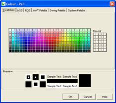
Select the colour and click OK to enable and display the new pen colour upon execution.
Colour - Text
Use the Colour - Text property to change the text colour for the label and edit control.
To change the text colour, click on the customise button to display the following dialog:

Select the desired colour and click OK.
Make sure to enable the text colour by selecting True in the Colour property. .